Brandon W. Mosley · UX Leader

Role Director, Experience Design (responsible for developing the navigation strategy, overseeing research, and validating deliverables with evidence-based design recommendations)
Team Sr. UX Designer · UX Writer · UX Researcher
Partners Product · Q2 Platform Enablement Stakeholders · Platform Vendor
Deliverables Competitive Navigation Analysis · Low-fidelity Prototype · UX Research Brief & Analysis · Usability Testing · Final Validated Nav Prototype + Content
Tools Axure RP · UserTesting · Maze · Grammarly · Miro
Timeframe Ongoing
Valley is migrating to a next-generation Q2-powered business banking platform, aiming to complete full implementation by year-end 2026. A mandated platform upgrade for Q3 2025 required a strategic shift from vertical to horizontal navigation, driving a compressed timeline for critical navigation redesign ahead of migration.
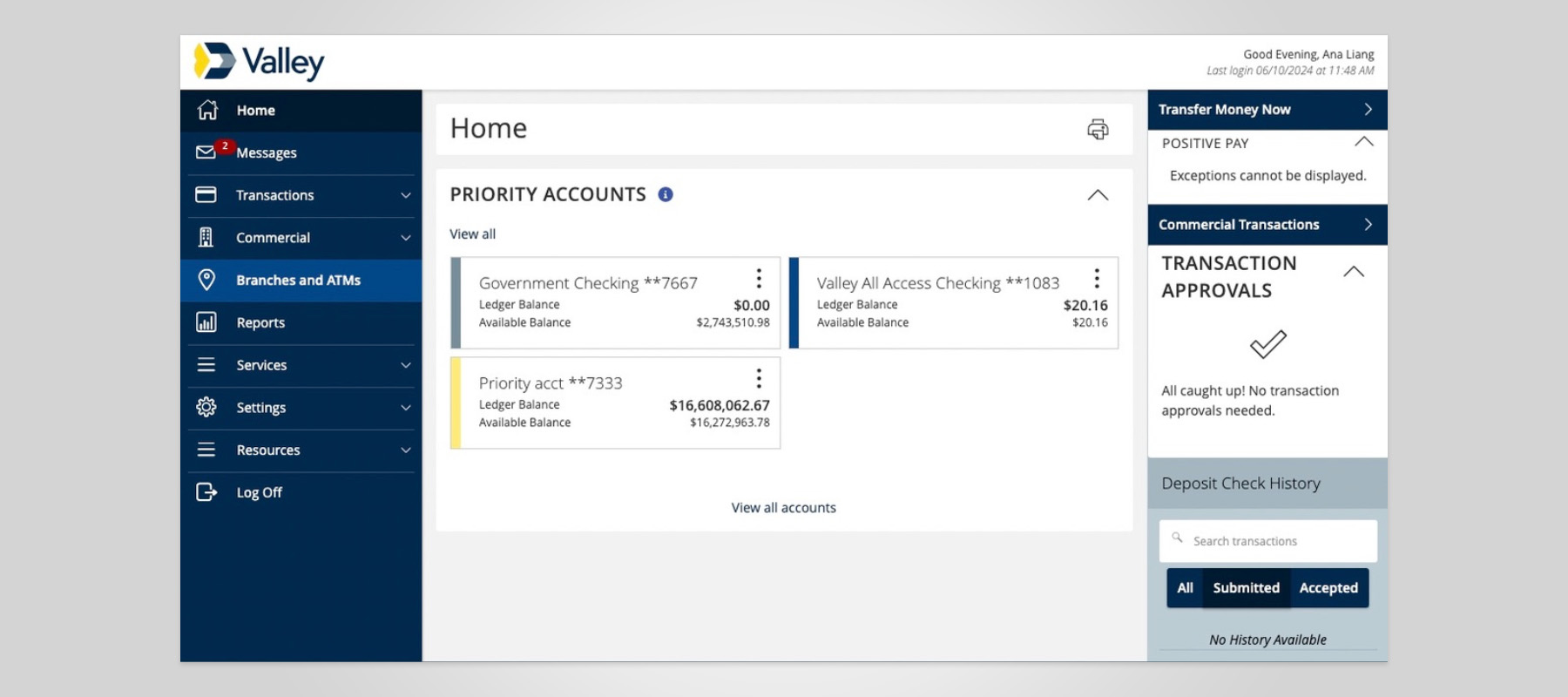
The current platform has user pain points:
As a starting point, the Experience Design team conducted a short-term study to identify industry-standard trends and guide us toward a direction for usability testing.
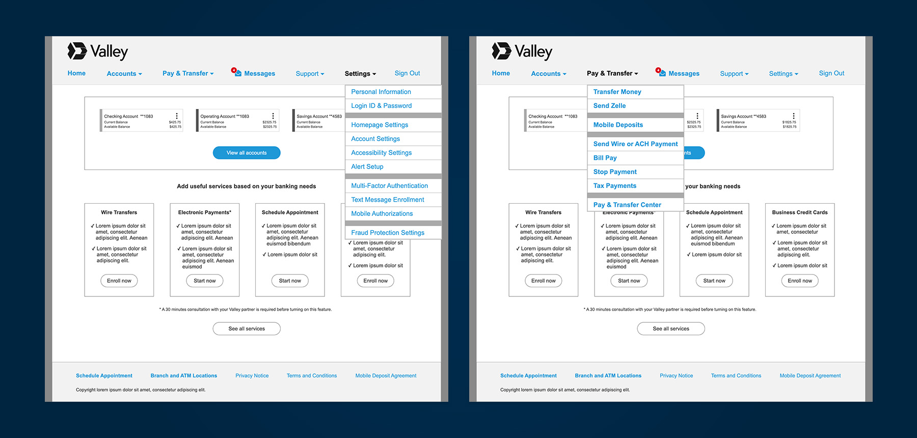
My team met with stakeholders to better understand the business banking services being offered and the intent behind their naming. For example, we needed clarification on what services like Positive Pay actually are, as the menu labels were not intuitive or self-explanatory.
We look at analytical data to identify the top 20% of tasks user perform 80% of the time to indicate priority items.
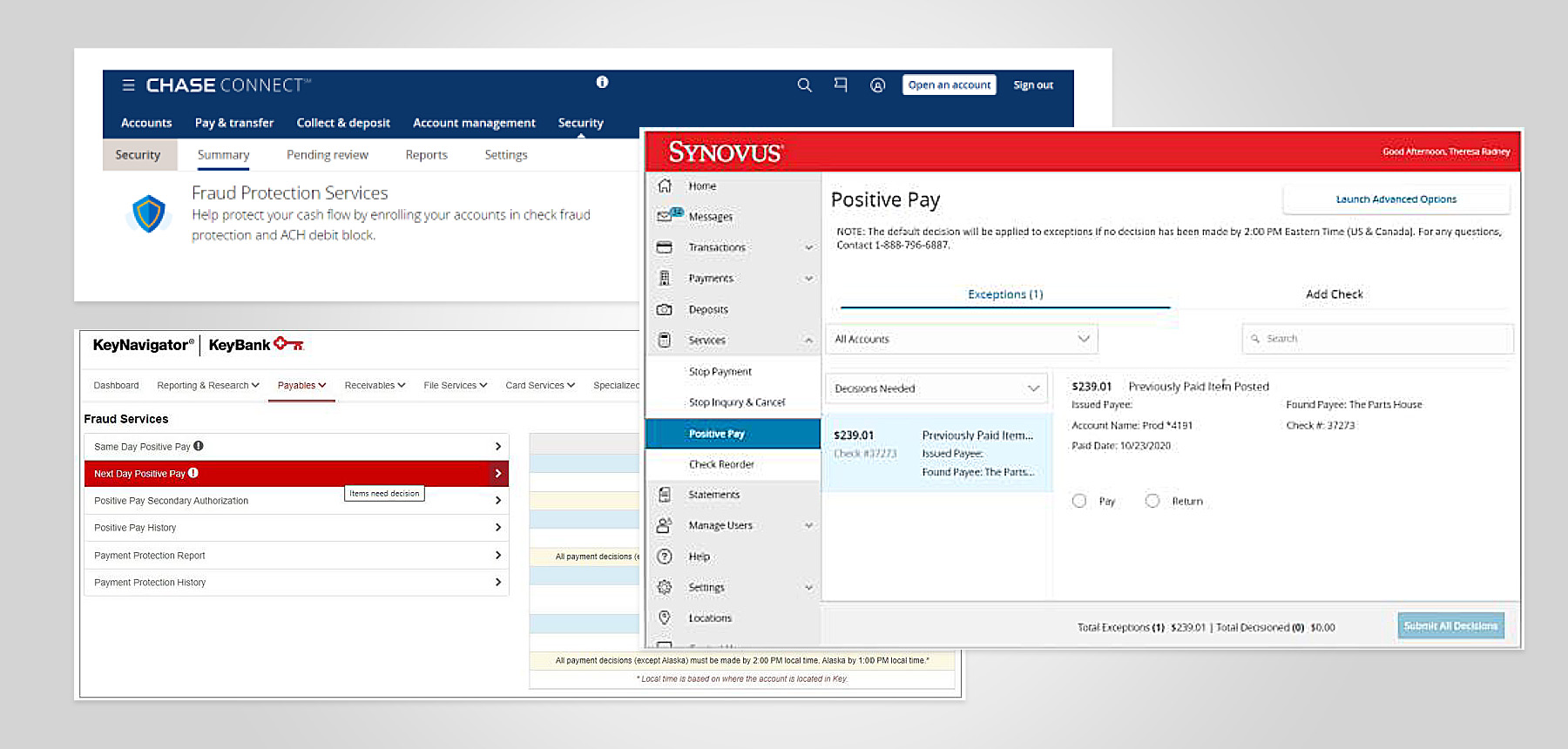
A comparative navigation audit was conducted across leading and competing US banks, including:
Across competitors, we observed strong consistency in:
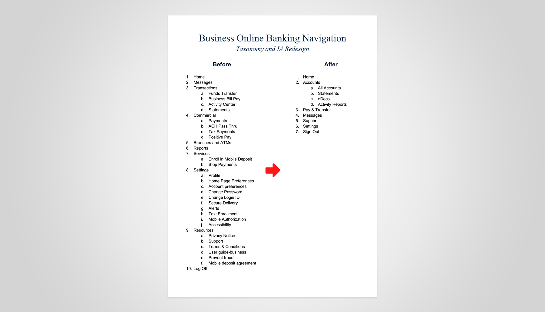
Applying what we learned from industry patterns and analytical data, we developed a new taxonomy that guided two card-sorting rounds and a tree test using a low-fidelity prototype.
Our general population test subjects were business owners.
Test artifacts are unavailable, but insights informed how my team approached the next prototype iteration.
In parallel, I oversaw the creation of high-fidelity mockups that illustrated our vision for an optimized digital banking experience. These artifacts provided Q2 and stakeholders with a clear blueprint for investment and cross-functional engagement in customer-centric transformation.
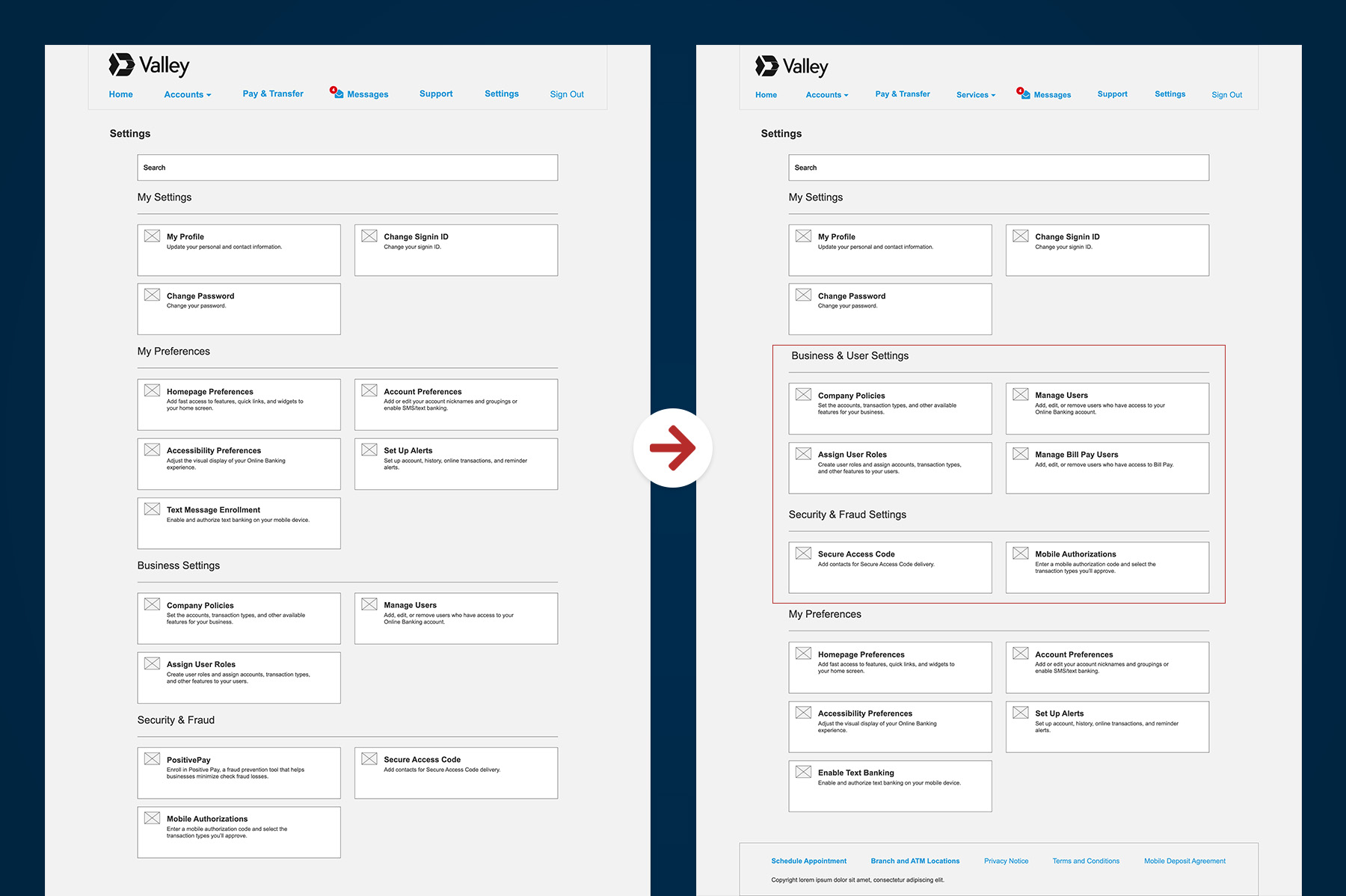
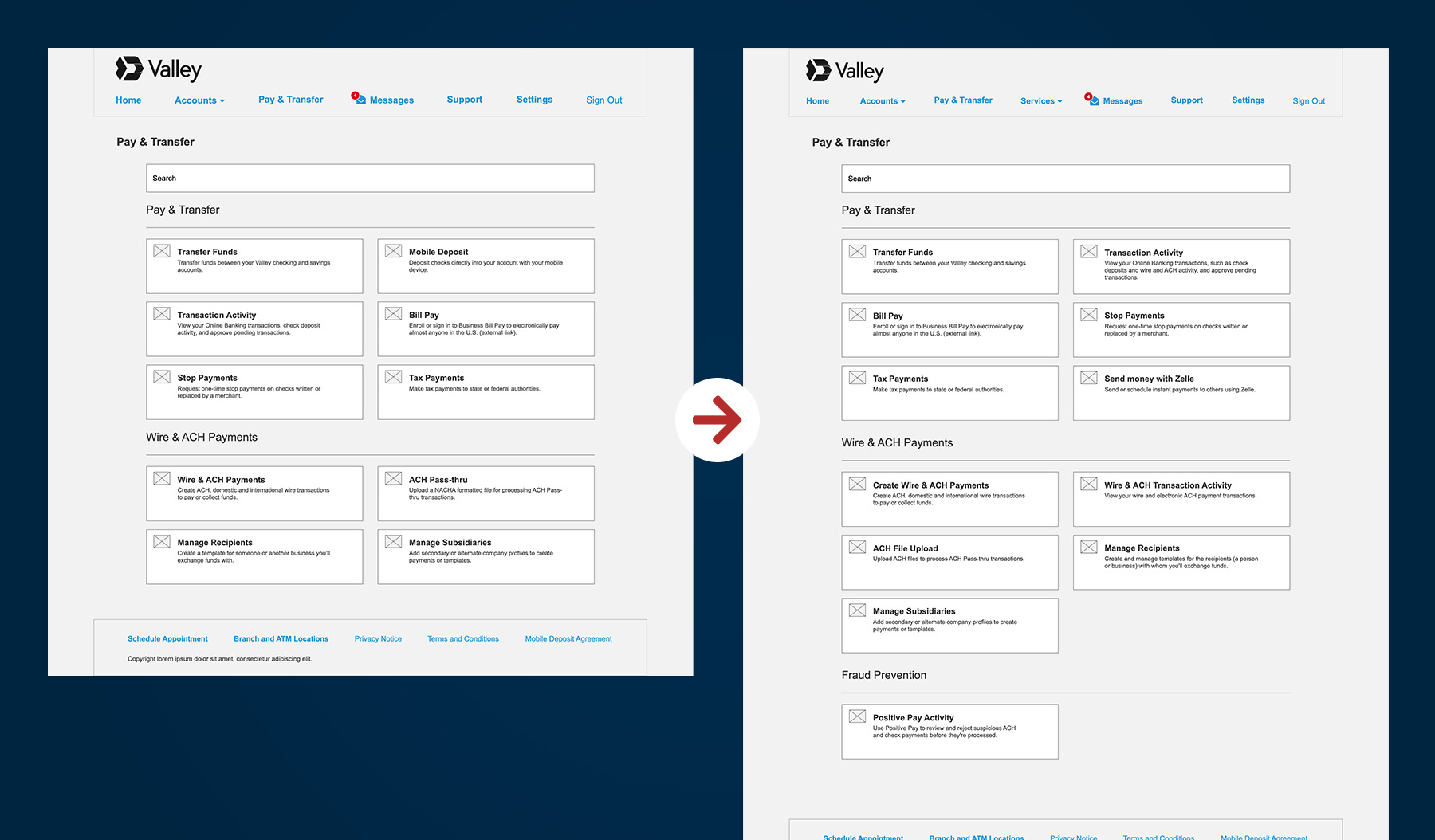
As we worked with Q2, our Product team discovered previously unknown features and role-based navigation items in the vendor’s admin panel. We also learned about Q2’s customizable landing pages, which serve as category hubs rather than forcing users to navigate long menus.
Taking a new approach, my team incorporated these new nav items and landing page concepts, hypothesizing that they would:
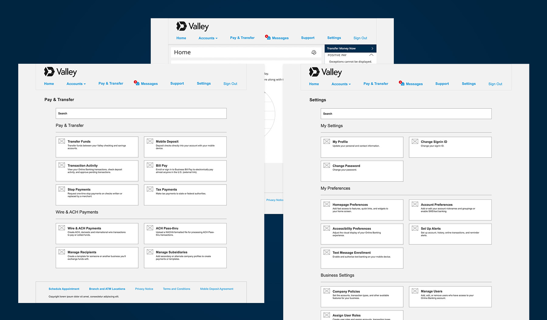
Our Product gained access to Q2’s admin panel, revealing additional navigation items tied to specific user roles that were not included in earlier prototypes. Thus, my team had to incorporate these additional features into the navigation structure.
Our test subjects included the general population and Valley small business owners with varying abilities, including power users. We will examine the outcomes of three specific user tasks.
The general population group generally outperformed Valley customers in task success. Our hypothesis was that the general population has broader banking experience and higher business revenue, thus using more business banking services.
Assign User Roles
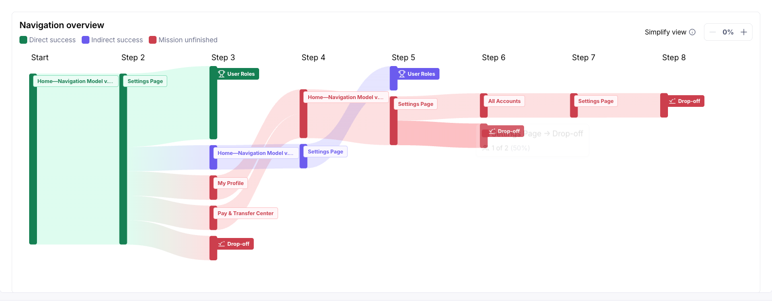
P1: “Under settings, then Profile, the user Roles should be more easily identifiable.”
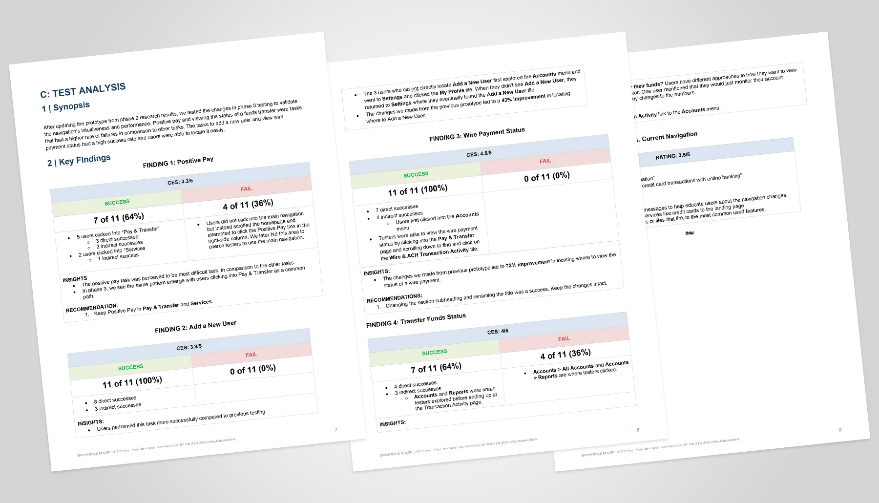
View Wire Payment Status
Positive Pay
P4: “Maybe there should be a separate tab for fraud alerts.”
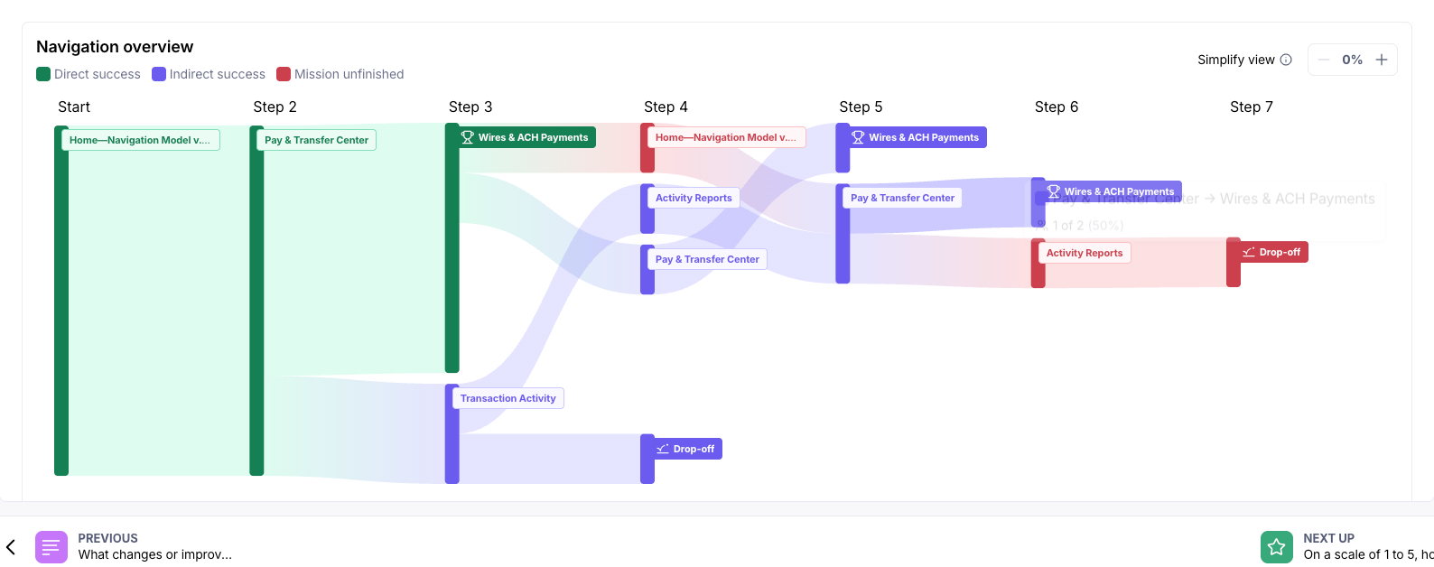
After updating the prototype based on Phase 2 research results, we tested the changes in Phase 3 to validate the navigation’s intuitiveness and performance.
[Report Screenshot]
Assign User Roles
View Wire Payment Status
Positive Pay