Brandon W. Mosley · Design Leader

Role UX Design Manager (UX Designer, Writer)
Team UX Researcher · Jr. UX Designer
Partners Product · Engineering
Team Deliverables High-fidelity · Content
Tools Figma · Maze · Miro
Timeframe 6-8 months
Company In-house
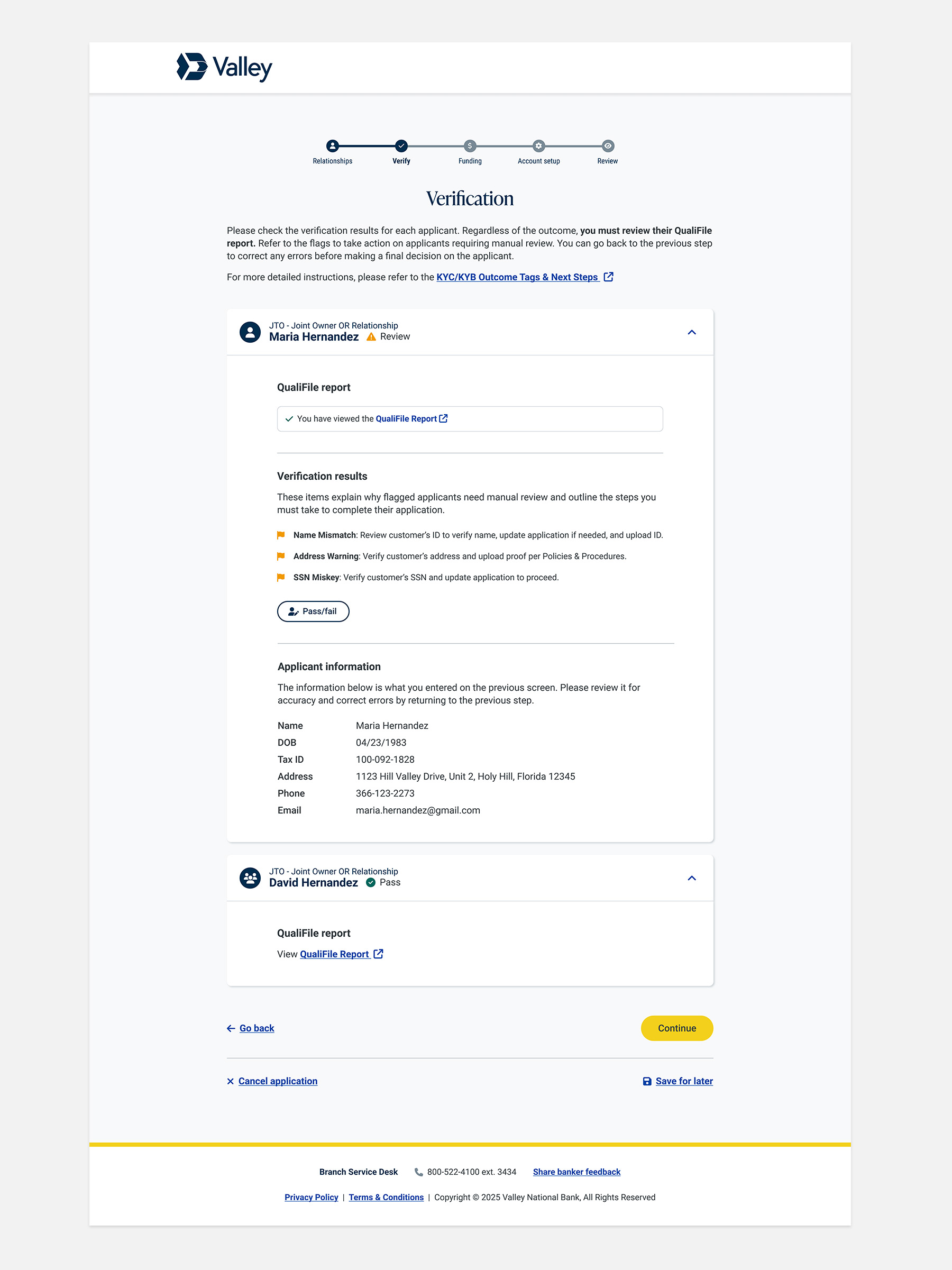
KYC (Know Your Customer) is a federal regulatory requirement that financial institutions use to verify customer identities during onboarding to prevent fraud, money laundering, and identity theft.
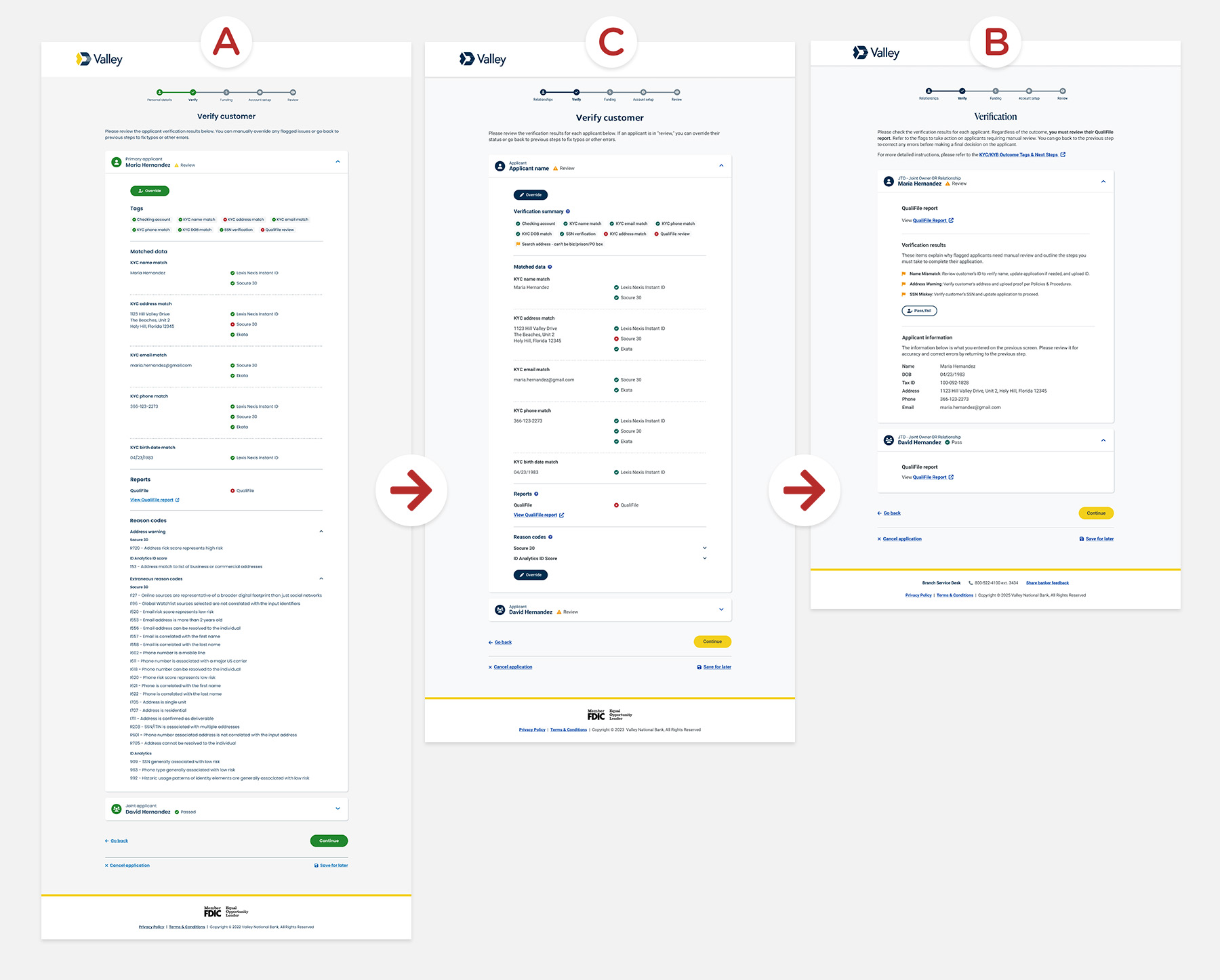
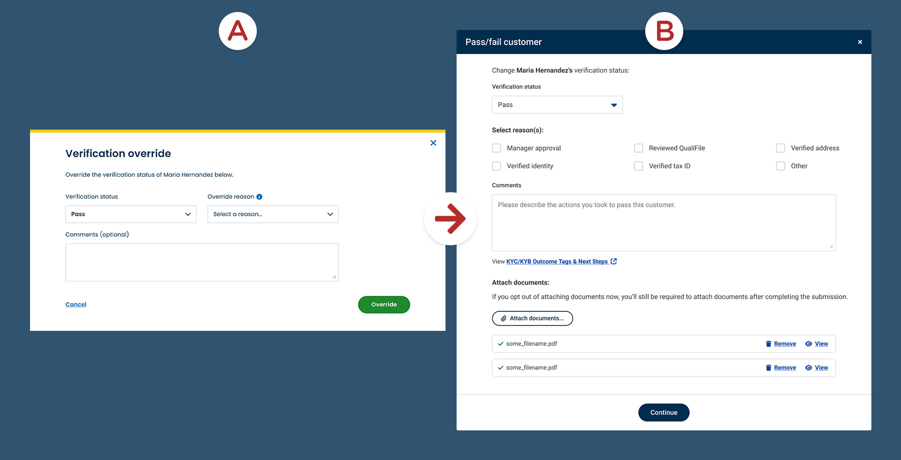
Valley's account opening platform shipped with an out-of-the-box KYC solution that created significant comprehension challenges for branch bankers. Errors, incomplete submissions, and manual overrides became routine, driving up back-office corrections and slowing account approvals. The experience needed to be redesigned to reduce risk and help bankers execute with confidence.
Customers experienced account opening delays
Abandoned applications sent wrong notifications and caused onboarding delays, turning routine account openings into friction at trust-sensitive moments.
Application errors created compliance and operational risk
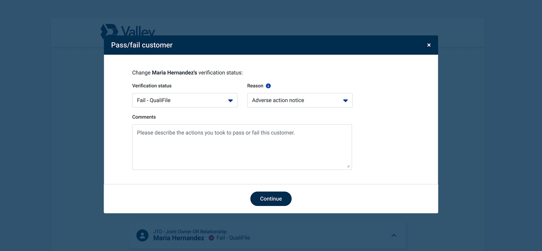
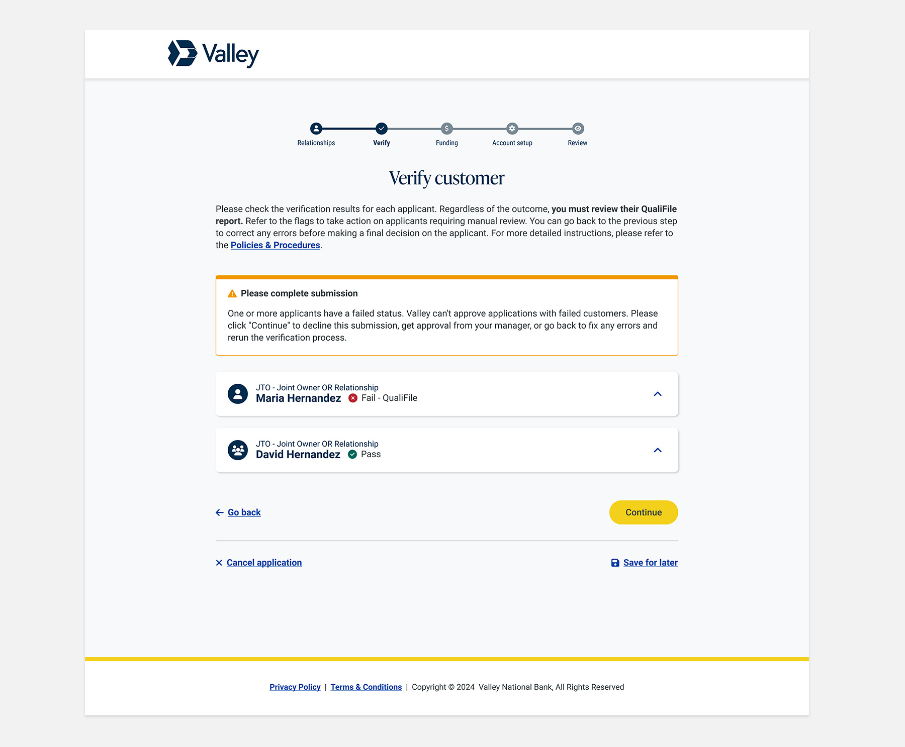
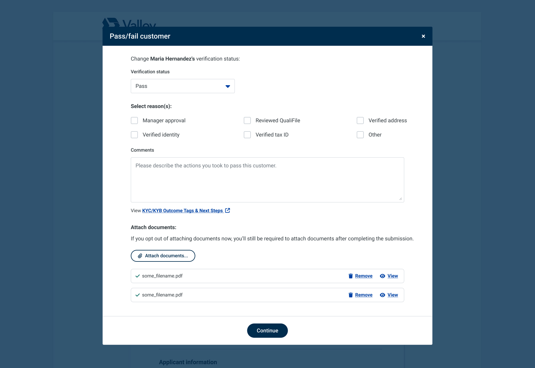
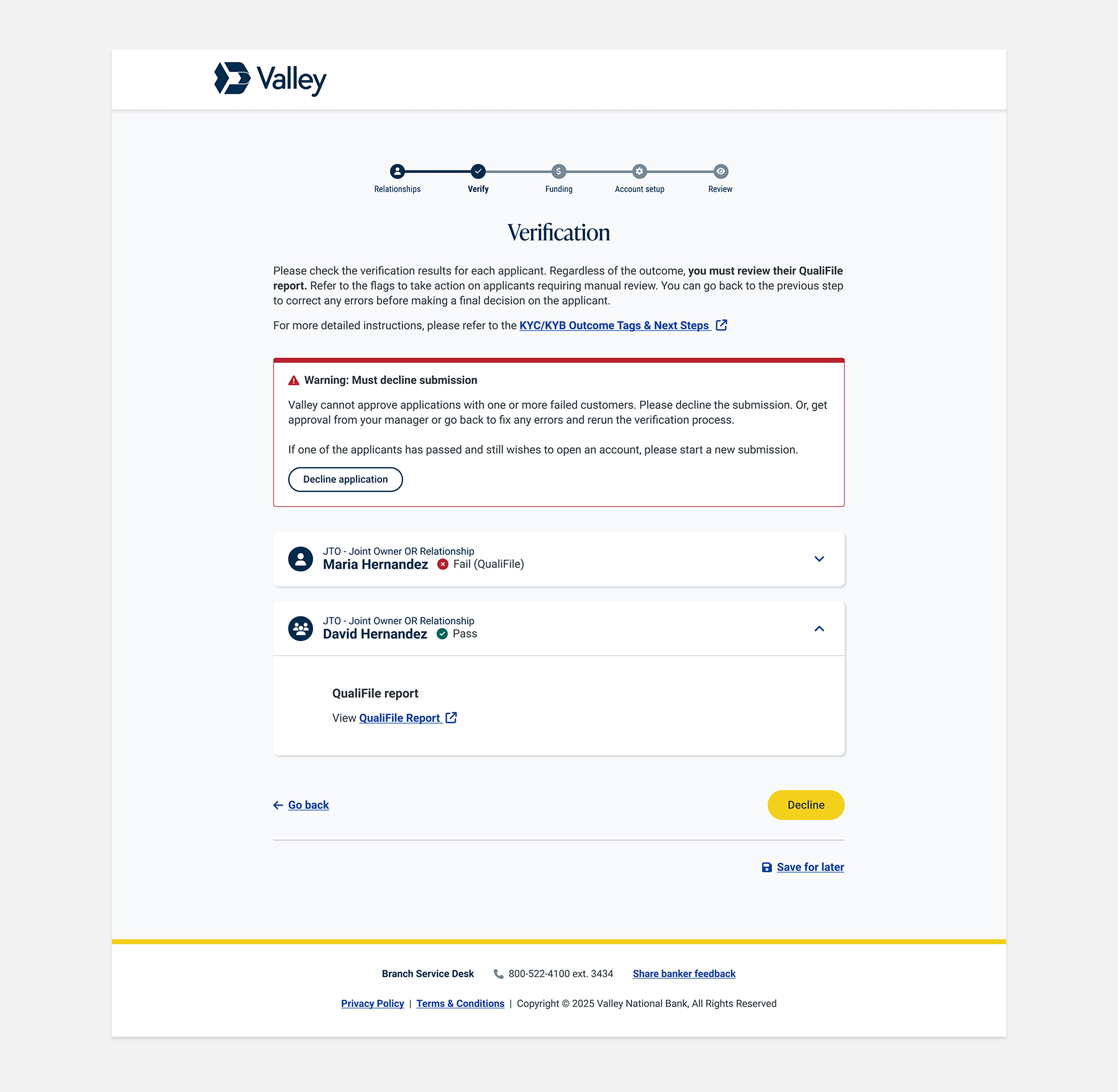
Over 400 mishandled applications triggered back-office corrections and audit risk because bankers didn't know how to properly decline a failed customer.
Bankers lacked guidance to act with confidence
The interface's color-coded indicators and unclear next steps left bankers guessing, with verification handled inconsistently across branches.
Improve Banker Compliance
Improve regulatory compliance by boosting associate confidence and adherence.
Error Reduction
Minimize operational risk and improve application accuracy by reducing errors caused by manual verification overrides.
Optimize the Verification Process
Accelerate customer onboarding by streamlining verification, reducing wait times, and improving customer satisfaction.
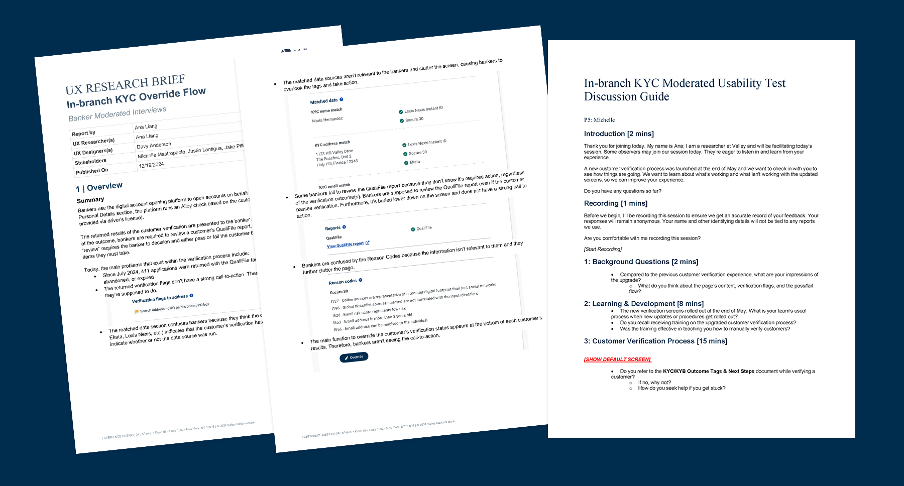
The account opening platform's design was heavily shaped by the technical constraints of two integrated systems: Alloy, which handled fraud and compliance checks, and Terafina, the account opening platform itself. Knowing the out-of-the-box solution wasn't optimized for banker workflows, I directed our UX Researcher to conduct interviews with a pilot group of branch associates to surface exactly where the experience broke down.
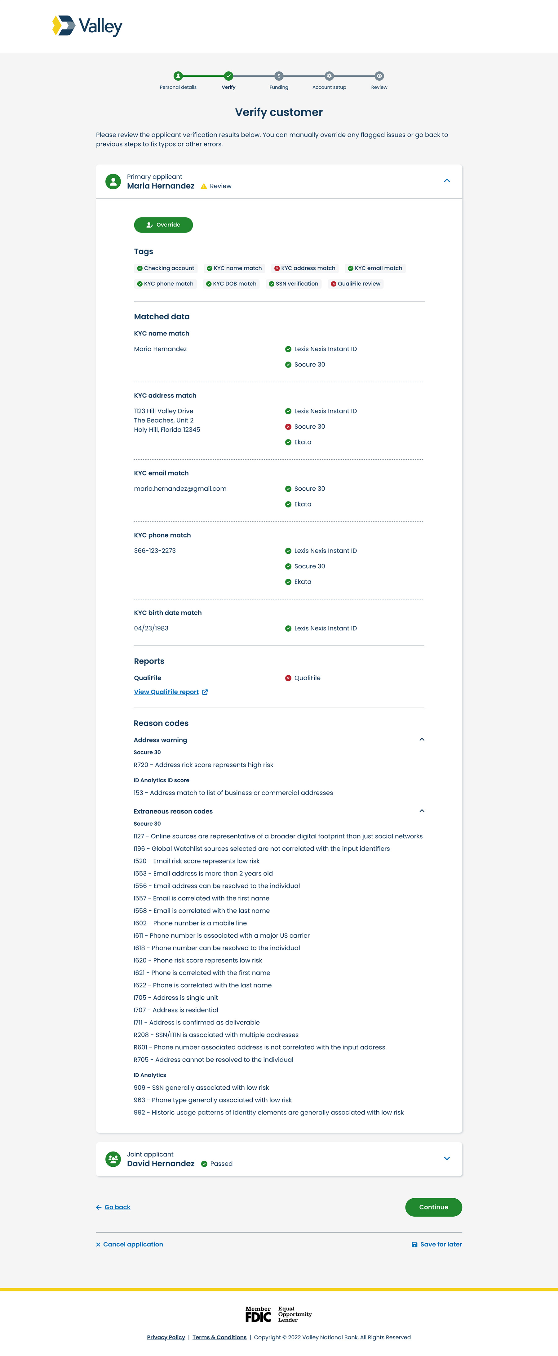
The research pointed to a clear theme: bankers could move through the process, but lacked the confidence and clarity to act correctly.
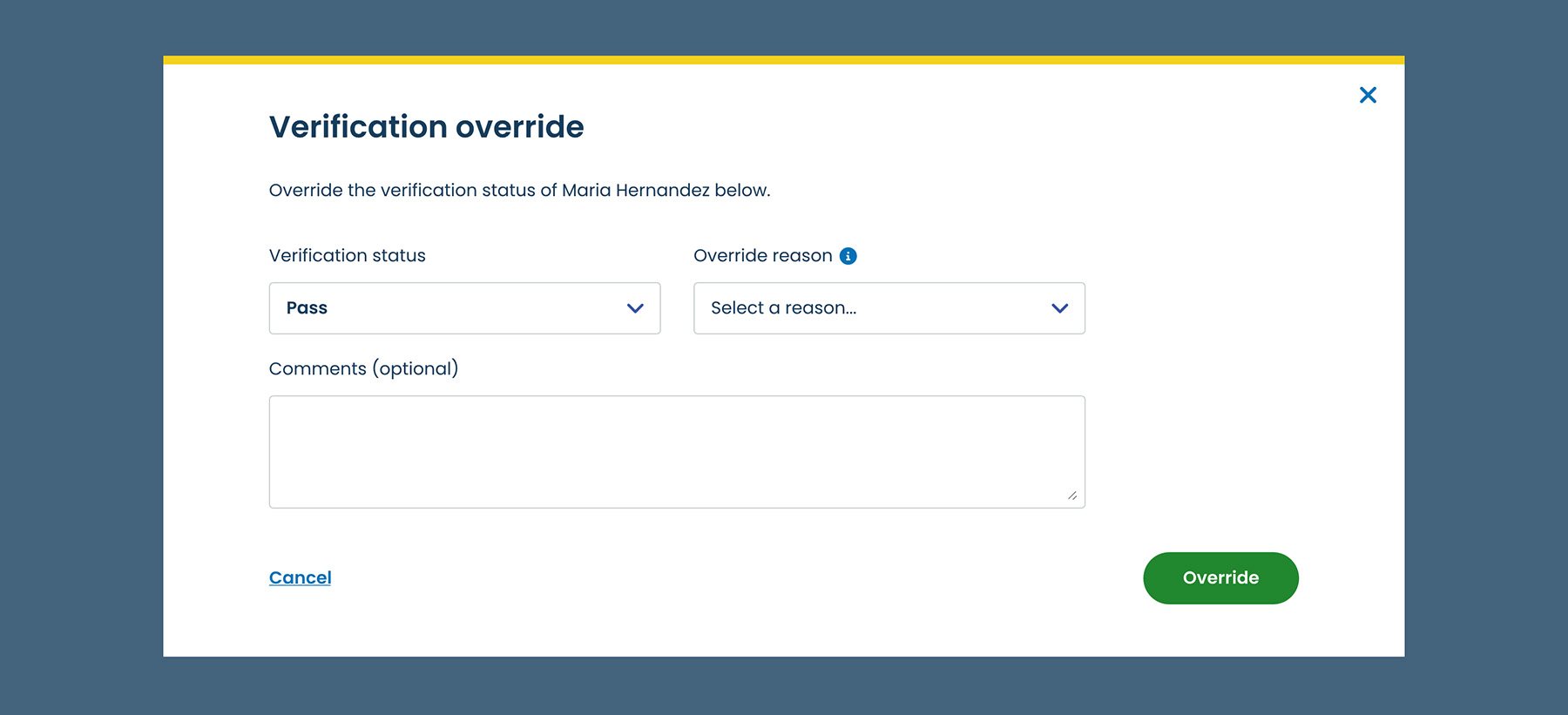
With the findings analyzed, I shifted into execution mode, taking a hands-on role in translating research into design decisions alongside the team.
Despite the initial improvements, bankers were still mishandling applications. The banking retail team escalated feedback, and my team was tasked with resolving the lingering issues.
With a broader Experience Design team reporting to me by this point, I stayed hands-on, directing UX Research and Design while personally leading the content strategy as UX Writer.
The feedback revealed that the interface was still creating confusion at critical decision points.
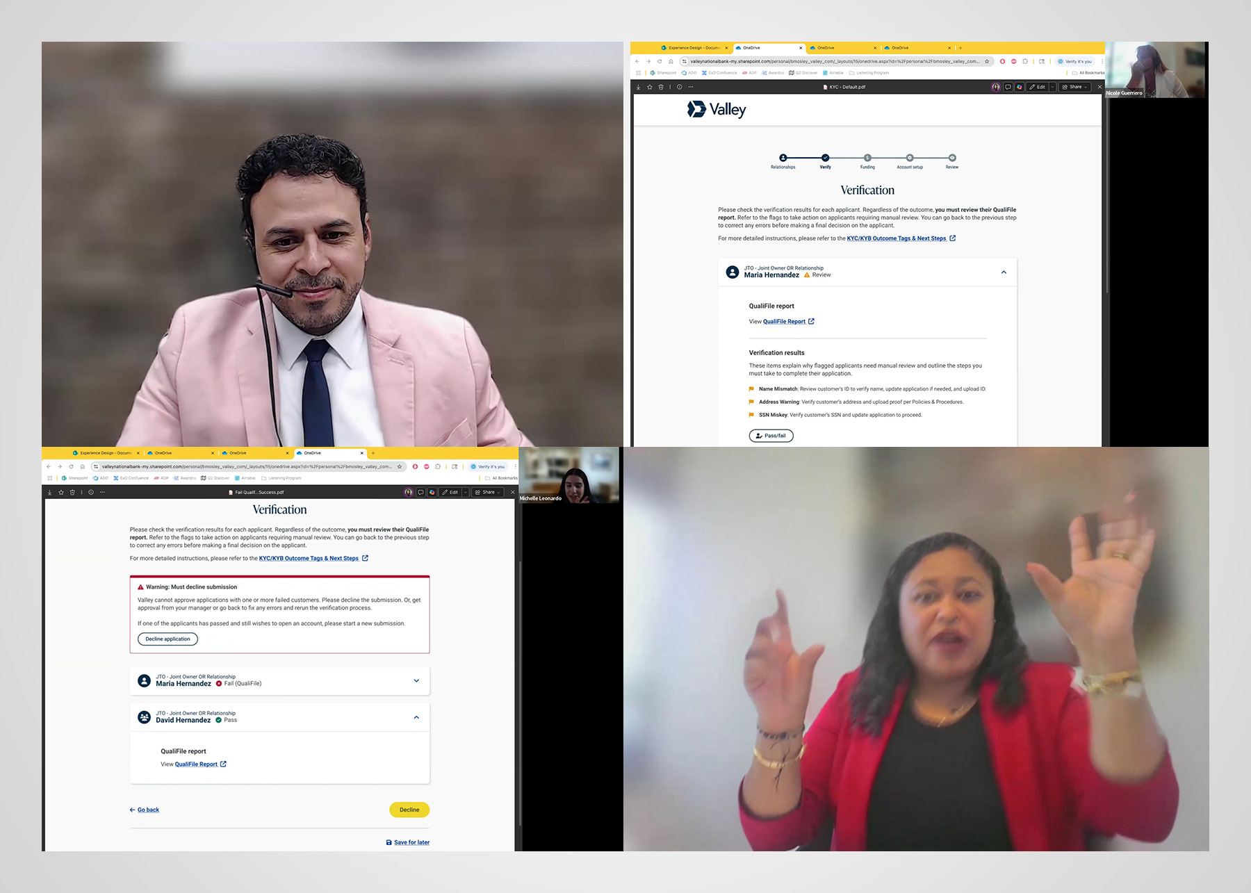
I led the research effort from brief to execution, coaching our junior UX Researcher on how to solicit actionable feedback through moderated usability testing. We recruited branch employees who frequently appeared on the deficiency list, along with Learning and Development associates responsible for banker training.
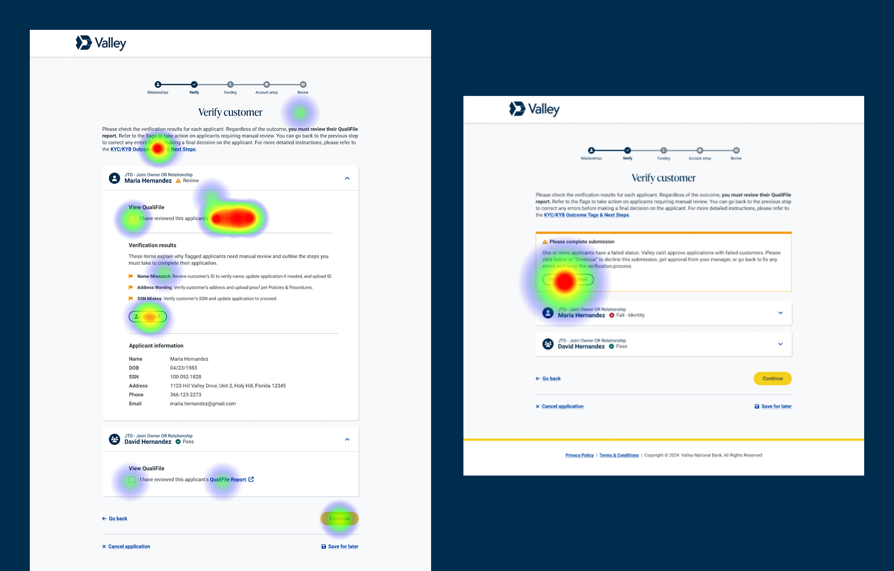
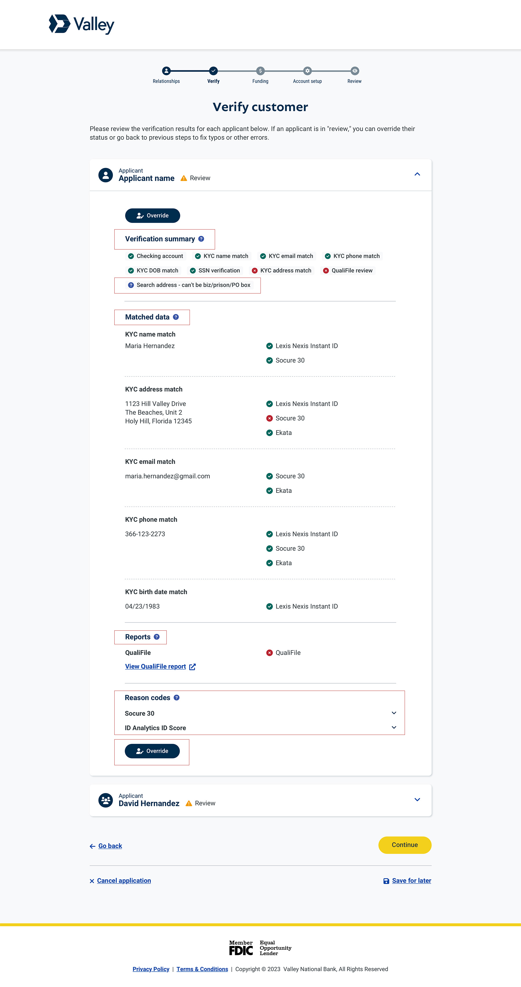
The updated flow tested well overall, but exposed gaps in step-by-step guidance and flexibility.
Compliance monitoring revealed a troubling signal: despite two rounds of research-driven redesign, application mishandling was still increasing. The interface had improved, bankers rated it positively, and yet the numbers told a different story.
Rather than accept the data at face value, I oversaw the researcfollow-up interviews to investigate whether the problem was still rooted in design, or somewhere else entirely.
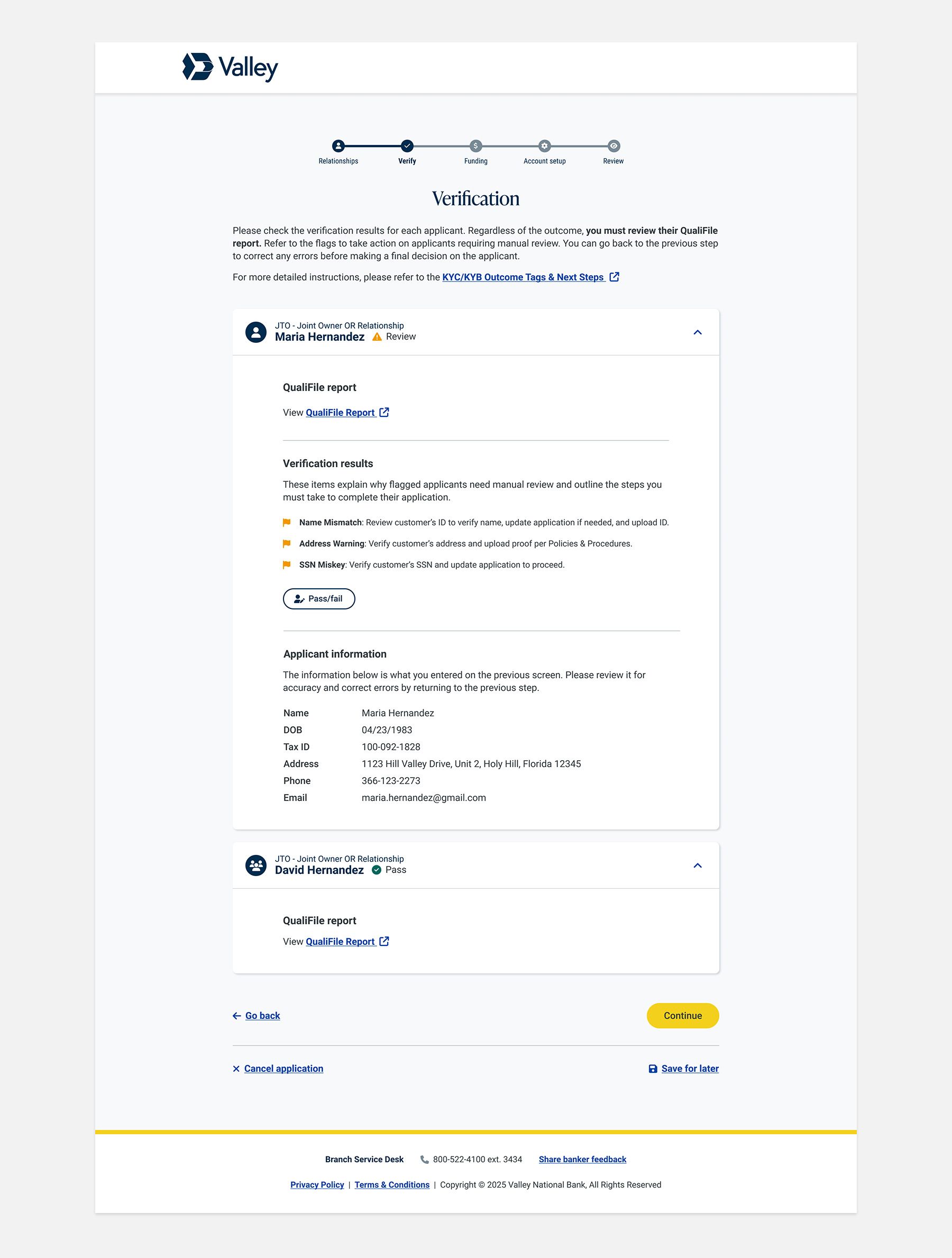
The design had done its job. What remained was outside the scope of UX to solve. Our hypothesis pointed to deeper operational factors, including inconsistent training practices and underlying incentive structures, that no interface change could fully address.
We documented our findings and I escalated them to Retail and Learning and Development with a clear recommendation to close the gap through improved training and support materials.
This was a two-year, multi-phase effort to fix a compliance problem that the interface alone couldn't fully solve. As a player-coach, I stayed close to the work across every iteration, directing research and design while serving as UX Writer on key deliverables.
When data showed that behavior still lagged behind the redesigned interface, I led follow-up research that correctly identified training gaps as the root cause and escalated findings to stakeholders. The work improved banker confidence, reduced workflow friction, and drove more consistent, compliant execution at the point of service.
9 mins
Average reduction in customer wait time while bankers perform verification process as indicated through task duration metrics.
92%
Consistent and compliant execution, as reflected in audit findings, error reporting, and compliance checklists.
4.6 / 5
Banker confidence and satisfaction scores from customer-facing interactions, with a noted reduction in task-related stress.
Observed vs. Stated Behavior
What users say often differs from what they do, underscoring the need for testing.
Limits of UX Influence
UX can meaningfully shape behavior within digital systems, but cannot fully control factors outside the interface.