Account Opening: Consumer Flow

Valley is a 94-year-old commercial and retail bank with approximately $60 billion in assets. With over 230 regional branch locations in New Jersey, New York, Florida, and Alabama, and an employee base of nearly 3,800, Valley is undergoing widespread digital transformation.

Role UX Design Manager

Partners Head of Design & Research · Product  · UX Research · Content Strategy · Engineering · QA

Deliverables User Stories · Design System · High-fidelity Prototype

Tools Figma · Sketch · Miro · Illustrator · Maze · User Testing

Timeframe 9 months

Company In-house

The Problem

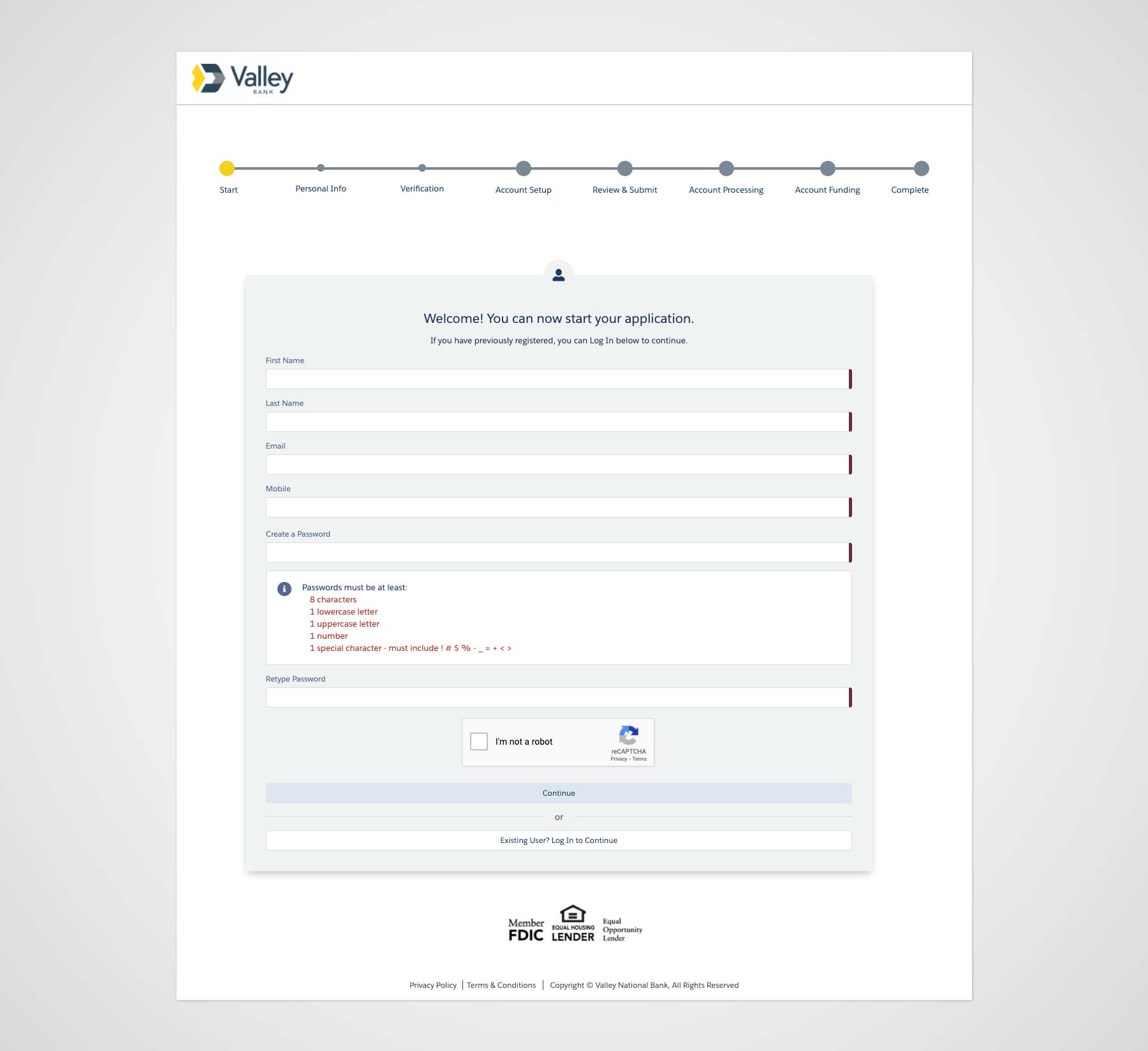
Banking with Valley was proven difficult during the pandemic when customers lost the white-glove service they experienced in branches. As part of its growth strategy to reach a wider audience, enable customers to expand their relationship with Valley, and offer products that meet customer goals, Valley initiated new digital account opening experiences using an off-the-shelf solution with limited customizations.

Problem 1: Consumer Account Opening

The current consumer account opening experience comprises over 12 arduous steps that take over half an hour to complete. The technology is old, and opening an account with Valley still requires manual paper and review processes, which slows the time to account opening.

  • 56% of users didn’t proceed beyond the first page of the old retail application.
  • The former account opening had a 2.5% conversation rate, ten times lower than leading competitors.
  • Only 1 in 3 customers have more than one active Valley account.
Problem 2: Commercial Account Opening

Opening commercial deposit accounts is a time-consuming and tedious process compared to consumer accounts.

  • It can take one to two hours to open a small business account.
  • Opening a small business account must occur in a branch.

Learn more about how we solved account opening friction for new and existing customers >

"How do we enable customers to self-serve and expand our products and services nationwide while growing our assets?"

Before

A screenshot of the old experience.

Opportunity

  • Operational Efficiency: Increase efficiency and reduce errors by establishing a digital account-opening process that guides users through data entry, document upload, and system validation, eliminating manual back-office remediation.
  • Multi-account Opening: Boost customer satisfaction and acquisition by reducing account-opening time with interactions and screen flows that let users select and open multiple account types in a single session.
  • Seamless Onboarding: Increase digital adoption by enabling users to verify identity, select account services, and set up online banking account credentials and preferences within the integrated digital account opening workflow.

Process

Research & Discovery

Stakeholder Interviews

I initially partnered with UX Researchers and Product Managers to collect and synthesize analytical data and customer feedback that later informed design decisions. Today, I manage a team of designers and writers to continue the work.

Platform Analysis

As an off-the-shelf solution, the platform required a deep understanding of its component library.

Listening

Partnered with the UX Research Team and Experience Strategist to collect customer insights from listening programs and surveys, identifying opportunities to enhance the experience.

No items found.

Define

User Stories

I generated user stories with scenarios and acceptance criteria, which helped the cross-functional team understand user tasks, define requirements, and generate QA testing scripts.

No items found.

Ideate

I lead weekly UX workshops with Product Managers, UX Researchers, Designers, and Writers, to define requirements and gather feedback on design concepts. These workshops involve some whiteboard and rapid prototyping.

No items found.

Branding

No items found.

UX Design

No items found.

Visual Design

An agency initially started the visual design process, which I took over and established a design system and improved the look and feel. I designed Over 70 new screens (including mobile designs) with a cleaner interface and created prototypes for user testing. My teamhas since evolved Valley's design system, which we rolled out across the account opening streams in Q2 2023.

No items found.

Testing

I partnered with UX Researchers to test page flows for clarity, intuitiveness, and understanding of tasks. Testing mainly was successful, with some feedback suggesting clarity around language or labeling of instructions, buttons, and other UI components. I iterated on the designs based on user feedback. Today, I coach my direct reports to further design thinking practices. In some cases, I function as the UX Resesearcher and conduct usability testing within my unit.

Add Beneficiaries

Objective: Gauge how well users understand the process of adding beneficiaries to CDs. 

Method: Unmoderated

Summary: Users find adding beneficiaries an intuitive and straightforward process with little friction, but it was not immediately apparent that the system added their beneficiaries to the CD. They prefer to actively save their designations or receive a confirmation that their input was successful.

  • "Clicking the drop down and adding the beneficiaries couldn't be any easier. It was seamless; it was quick; and it was really well organized."
  • "I do wish there was a save screen for the first beneficiary... something like a 'save' and 'add new.'"
  • "I'm looking for a save button. I'd rather have a save button than a continue button."

Design Strategy

  • Shorten the "Add beneficiaries" text below the headline to aid cognition.
  • Prevent errors by adding an "Add a beneficiary" CTA after the user opens the accordion.
  • Change the primary CTA label from "Add beneficiary" to "Add a beneficiary" to reinforce the singular action.
  • Change the secondary CTA label from "Add beneficiary" to "Add another beneficiary" to clarify the act of saving versus adding a new beneficiary.


Debit Card Limit

Objective: Gauge how well users understand why they cannot fund their accounts with a debit card after exceeding the $500 debit limit.

Method: Unmoderated

Summary: There's a high probability that users will reach the debit card limit, which prevents them from moving forward. Our mission was to determine how to best handle error reporting.

  • "I like being able to click on these different funding options and see why I cannot move forward."
  • "Option B would be the better choice. The color really makes it so that I notice the debt limit." 
  • "I actually like Option B better because someone could easily overlook the explanation of the debit limit." 

Design Strategy

  • Tell customers about the $500 debit card limit upfront under the subheading (not shown).
  • Alert customers when they exceed the $500 debit limit.
  • Tell users what to do when they exceed the debit card limit in the error message.


Funding Friction‍‍

Summary: User feedback and insights from exit-intent surveys and Hotjar session recordings revealed customer drop-off at the funding section. Evidence of pain points appeared when users encountered errors after skipping the funding area or attempting to link a bank account. We hypothesized that the language and required tasks weren't straightforward.

Design Strategy

  • Improve cognitive load by reducing the amount of text and adding numbered icons to each section to guide user behavior.
  • Improve error messages language to help users recover from roadblocks.
  • Ensure front-end build has field placeholders as specified in the design.

No items found.

Impact

Outcomes

  • Digital-Only Conversion Growth: Exceeded the original 40% conversion goal, achieving an average of 60% conversion to date.
  • Digital Deposit Generation: Achieved $1.2M in deposits through Valley Direct in year one, reinforcing the digital-first acquisition strategy.
  • New Customer Acquisition: Increased new-to-Valley customers by 150% through Valley Direct, meeting the 20% conversion rate goal and expanding the bank’s digital customer base.
  • Consumer Account Opening Performance: Increased conversion rate from 2% to 11% for new retail accounts, with average deposits of $5,845, reflecting customer confidence and a smoother onboarding process.
  • Reduced Account Opening Time: Enhanced the user experience by streamlining the online account-opening process from 12 to 4 steps, reducing the average time required from 45 to 15 minutes.
  • Customer Care Cost Reduction: Clearer flows and reduced friction reduced reliance on customer support, saving an estimated $88,200 per year.

Learnings & Reflections

  • User Stories Enable Alignment: Despite early resistance, user stories proved critical in aligning cross-functional teams, reinforcing user-centered thinking, and clearly defining requirements.
  • Documentation Drives Execution: Shared documentation ensured consistent communication across design, development, and QA, reducing ambiguity and rework.
  • Quality Control With Vendors Requires Rigor: Maintaining UX and quality standards is more complex with outsourced development and QA partners and requires active oversight.
  • Concise UX Writing Is Essential: Users rarely read on-screen content, so clarity and brevity are critical for reducing friction.
  • Testing Beyond Happy Paths Matters: User testing often validates ideal flows, highlighting the need for complementary methods to uncover edge cases and real-world friction.