
Brandon W. Mosley · Design Leader

Role UX Lead
Role Jr. UX Designer
Partners Product · Engineering · Marketing · Compliance · Retail Operations
Deliverables User Stories · Design System · High-fidelity Prototypes
Tools Figma · Sketch · Miro · Maze · User Testing
Valley's retail account opening relied on a legacy platform that couldn't scale and a customer experience that wasn't converting. Valley Direct and Valley's core banking products on its website were the first two streams selected to test the new platform and validate the market.
I executed the design end-to-end — partnering closely with product and engineering, pulling in direct reports at key moments, and using that collaboration as an opportunity to develop their skills.
Learn more about how we solved account opening friction for existing customers >
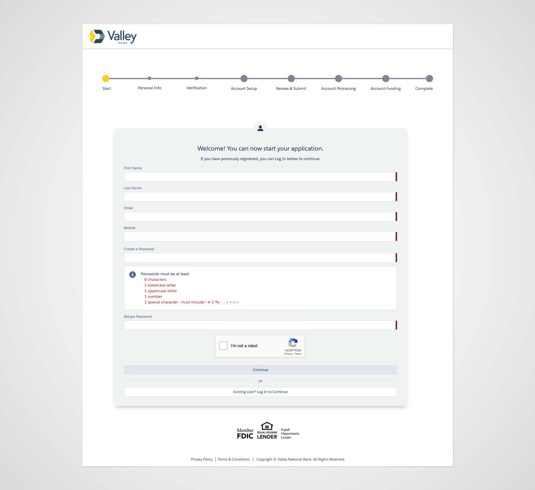

Routine tasks required branch visits
Customers couldn't add beneficiaries, joint applicants, or debit cards online. Adding beneficiaries required a notarized letter, joint applicants and debit cards required a branch visit.
Funding drop-off
The legacy platform used microdeposits to fund accounts, requiring customers to return and verify their deposit before it was accepted. Most never returned.
3-days to open an application
A form-heavy, multi-step process pushed customers to abandon before completing.

Grow application volume and deposits
Increase application starts, cut time-to-open, and remove exit points where customers drop.
Improve end-to-end conversion
Redesign the application flow to reduce steps, shorten completion time, and remove the friction driving abandonment.
Scale online account opening
Let customers open any core product online and onboard every branch to the new platform.
The first challenge wasn't design — it was ambiguity. Requirements were unclear, and stakeholder alignment was inconsistent. How did I solve this challenge?
I facilitated (or jointly-facilitated) workshops to engage business stakeholders, understand business challenges, and establish shared success criteria before any design work began.
Requirements-gathering sessions gave the team a shared understanding of what the experience needed to do — and why.
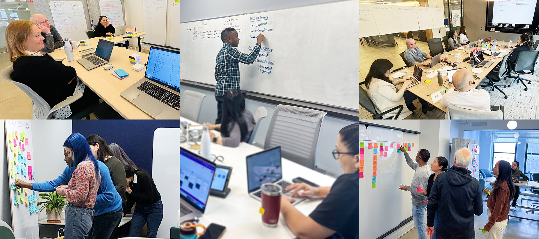
I coached the cross-functional team on maintaining a human-centered approach and on using data and user insights to inform our decisions through research and usability testing.
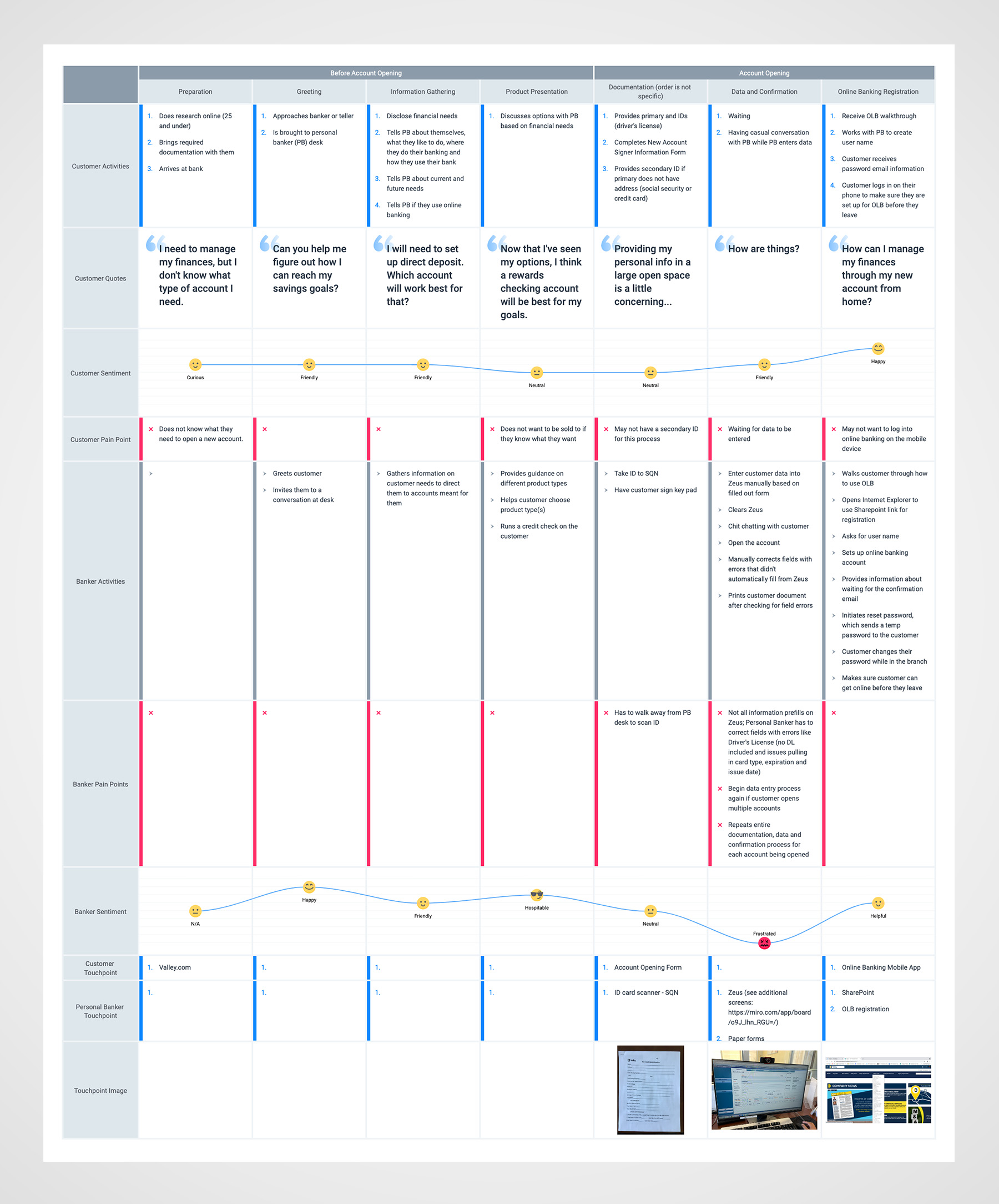
Mapped various user journeys to uncover pain pain and how back-office processes contributed to the customer experience.
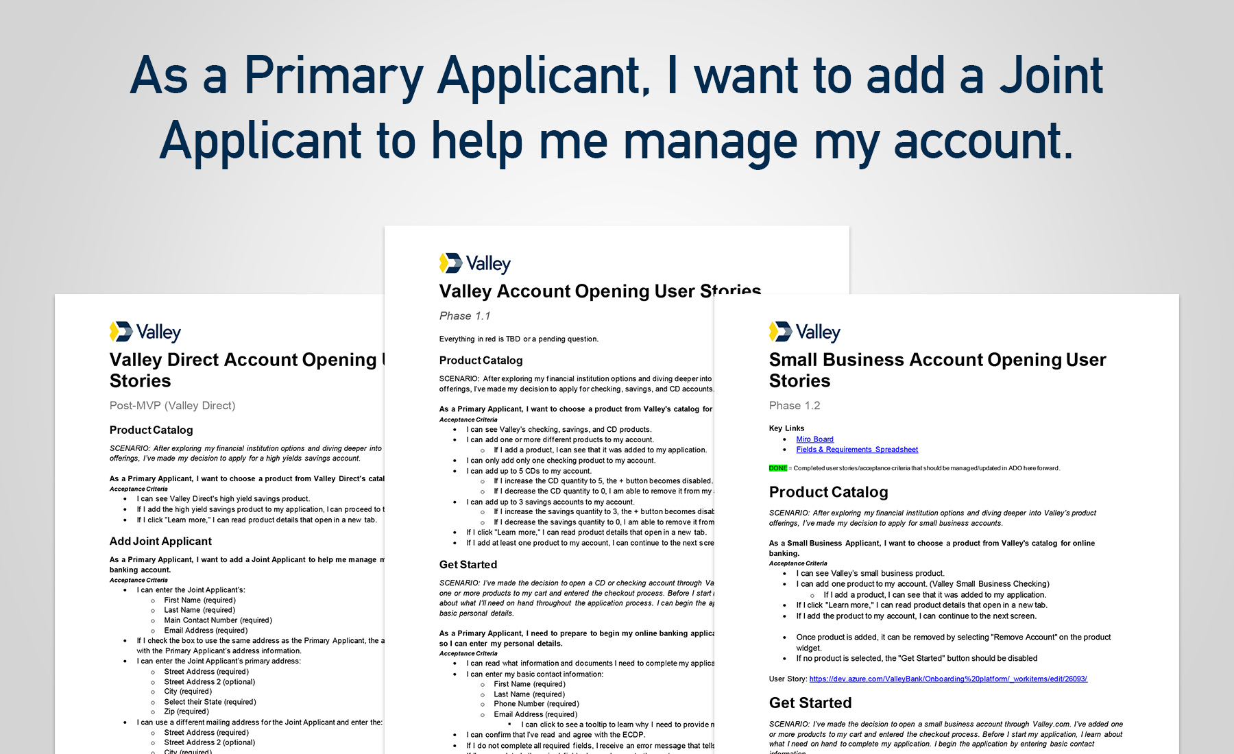
Valley's account opening lacked a shared design language and was disjointed from the parent brand's identity. Engineering output reflected that gap — inconsistencies, bugs, and unintuitive UI components were common, compounded by the limitations of the vendor's component library.
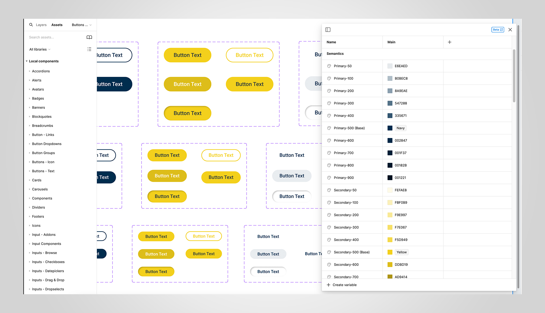
With all digital touchpoints along the customer journey in mind, I built a primary design system (pre-Figma) — components, interaction patterns, and content standards — grounded in Valley's brand guidelines and adapted for the vendor platform.
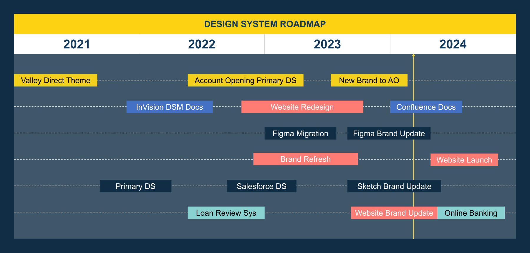
I created a design system roadmap and mentored my junior direct reports through the roll-out, using the work to develop their skills in component thinking, design documentation, and working within technical constraints. As the system matured, they took on increasing ownership of component maintenance.
I built an ongoing working relationship with the vendor’s engineering team — sharing specifications in a format their engineers could act on and collaborating to find solutions that preserved design intent within platform limitations. The partnership reduced bugs, increased time-to-market, and enabled a more accurate, efficient build process.
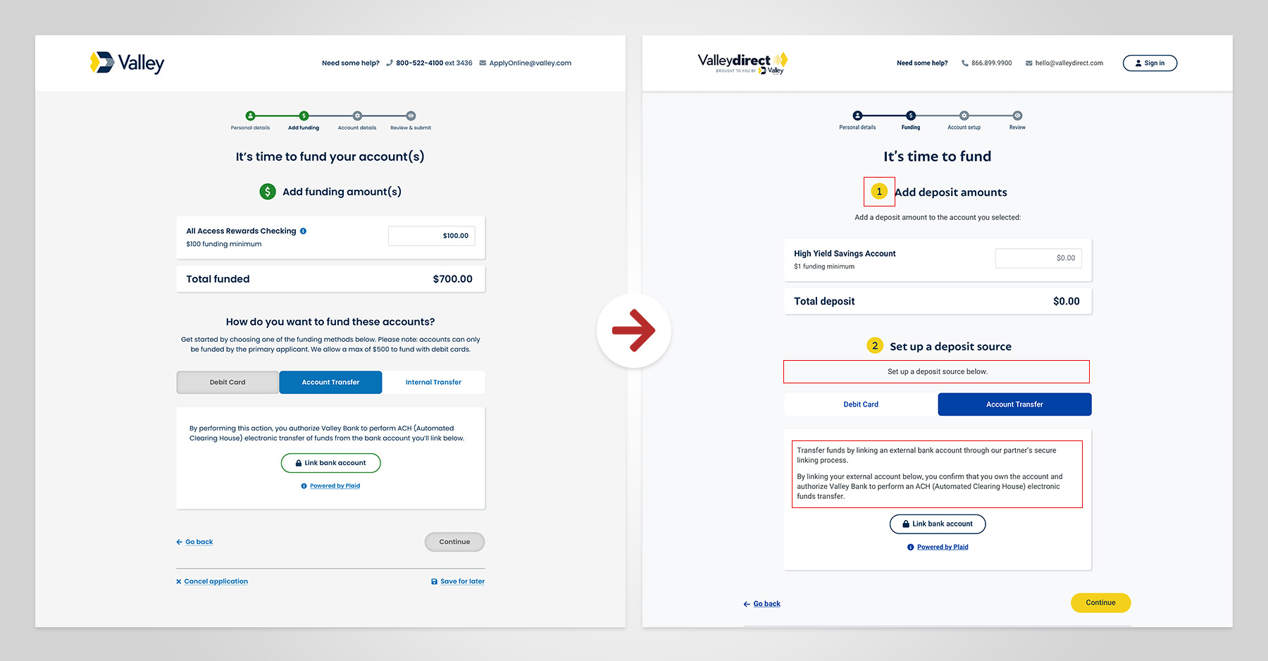
Funding on the legacy platform was completed via microdeposits — a process in which small test amounts are deposited into a customer's external bank account, which they must return to verify before funding is confirmed. Requiring a return visit caused a significant drop-off, as most customers did not complete the process.
To remove the return-visit requirement, we switched to real-time bank verification with Plaid. This created a new issue: users didn’t trust Plaid and hesitated to link external accounts.
I partnered with UX Research to understand user concerns. Testing confirmed the trust gap. Users needed explicit reassurance that their information was secure and the service was legitimate before they would proceed.
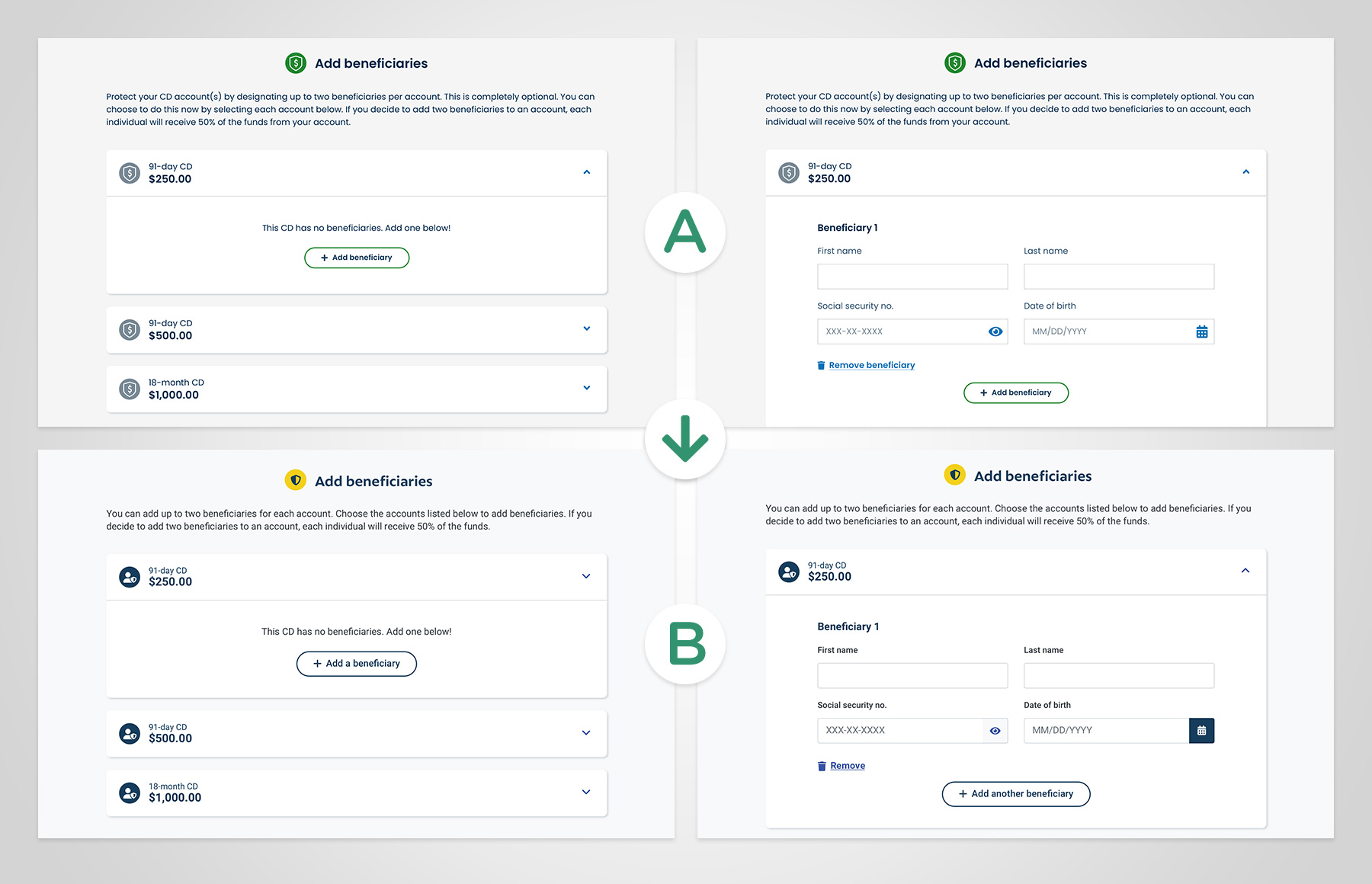
To reduce reliance on branches, decrease customer care call volume, and eliminate manual data entry, I designed a self-service beneficiary flow.
Previously, customers were required to mail a notarized letter to add beneficiaries — a significant barrier for anyone without easy access to a branch.
Testing showed users could navigate the process intuitively; however, a confirmation feedback gap created doubt at a trust-sensitive moment—users weren't sure their designations were saved.
"I'm looking for a save button. I'd rather have a save button than a continue button."
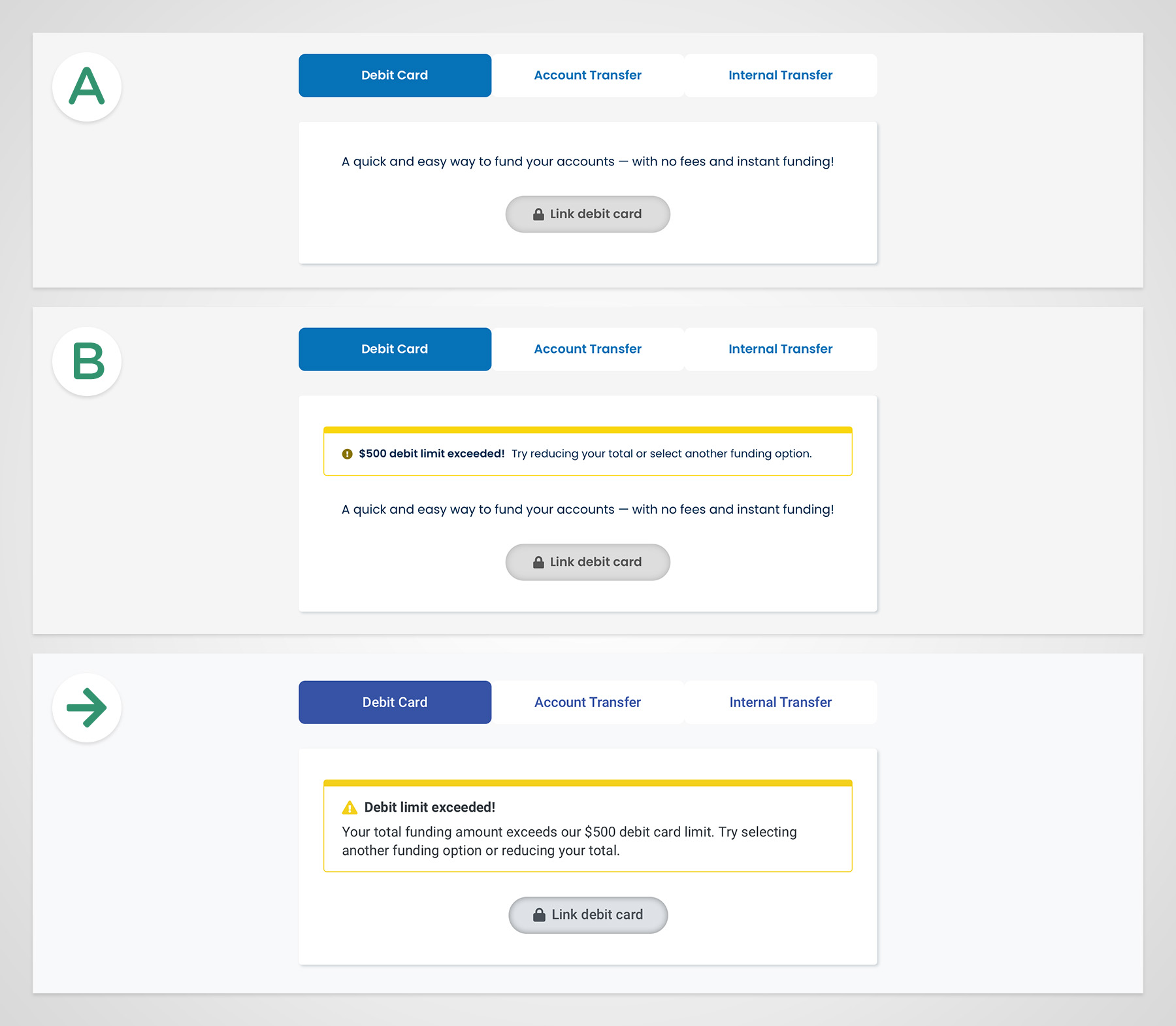
During testing, we saw users who chose to fund their accounts with a debit card frequently hit the $500 limit and were blocked from proceeding, with no clear explanation. As a result, they abandoned the account-opening experience altogether.
I partnered with UX research to validate two error treatments — a passive inline message versus a high-visibility alert — and the user response was decisive.
"Option B would be the better choice. The color really makes it so that I notice the debit limit."
In the end, my team and I delivered a scalable design system during Valley's corporate rebrand and a simultaneous migration to Figma. Our engineering partners received a single source of truth that reduced bugs, eliminated design inconsistencies, and sped up handoffs to engineering.
The result was a faster, more consistent build process and a customer experience that reflected it: application completion time dropped from three days to minutes, online account openings quadrupled, and customers could finally fund their account, add beneficiaries, and get a debit card without ever visiting a branch.
This multi-year initiative established Valley’s digital account-opening capabilities across multiple lines of business, including retirement, specialty banking, business, trusts, and estates — laying the foundation for future expansion into credit cards, mortgages, and additional offerings.
$88.2 K
Estimated annual operational savings from reduced customer care call volume.
10%
Conversion rate with Plaid (above the vendor’s industry benchmark).
20 mins
A 50% reduction in application completion time and from 12 steps to 4 — days to minutes.
4×
Growth in online account openings — from 5-20% of retail accounts (average $5,845 deposit) and 25% Valley Direct conversion rate.

Vendor relationships are a design tool
Treating the platform vendor as a partner (not a constraint) produced higher-fidelity builds and faster resolution of spec gaps.
Design systems build team capability
Building the system alongside the engineers created shared ownership that sped up speed to market.
Structure unlocks speed
Workshops and requirements sessions upfront reduced rework and kept the team moving with clarity rather than chasing alignment.


