Brandon W. Mosley · Design Leader

Role Experience Design (nav, research, content strategy)
Team Sr. UX Designer · UX Writer · UX Researcher
Partners Product · Q2 Platform Enablement Stakeholders · Platform Vendor
Deliverables Competitive Navigation Analysis · Low-fidelity Prototype · UX Research Brief & Analysis · Usability Testing · Final Validated Nav Prototype + Content
Tools Axure RP · UserTesting · Maze · Grammarly · Miro
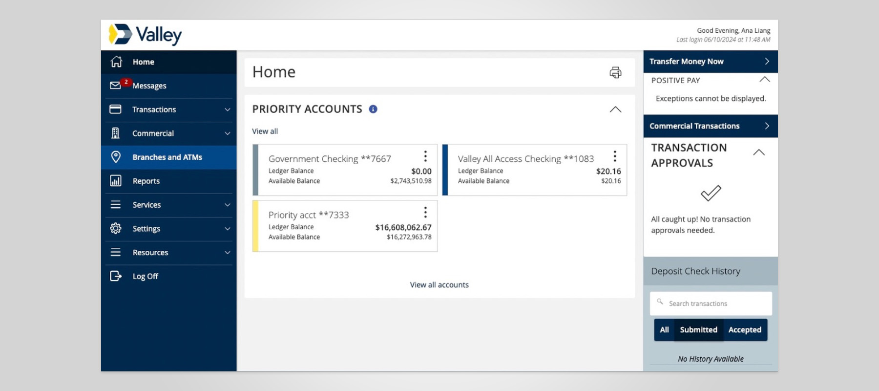
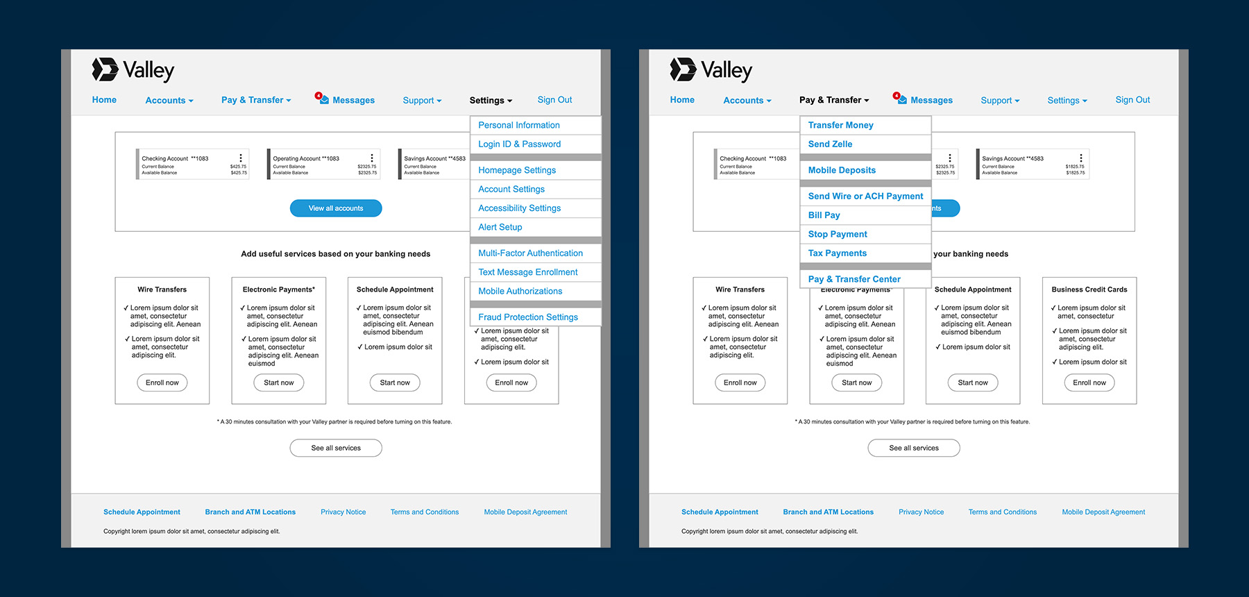
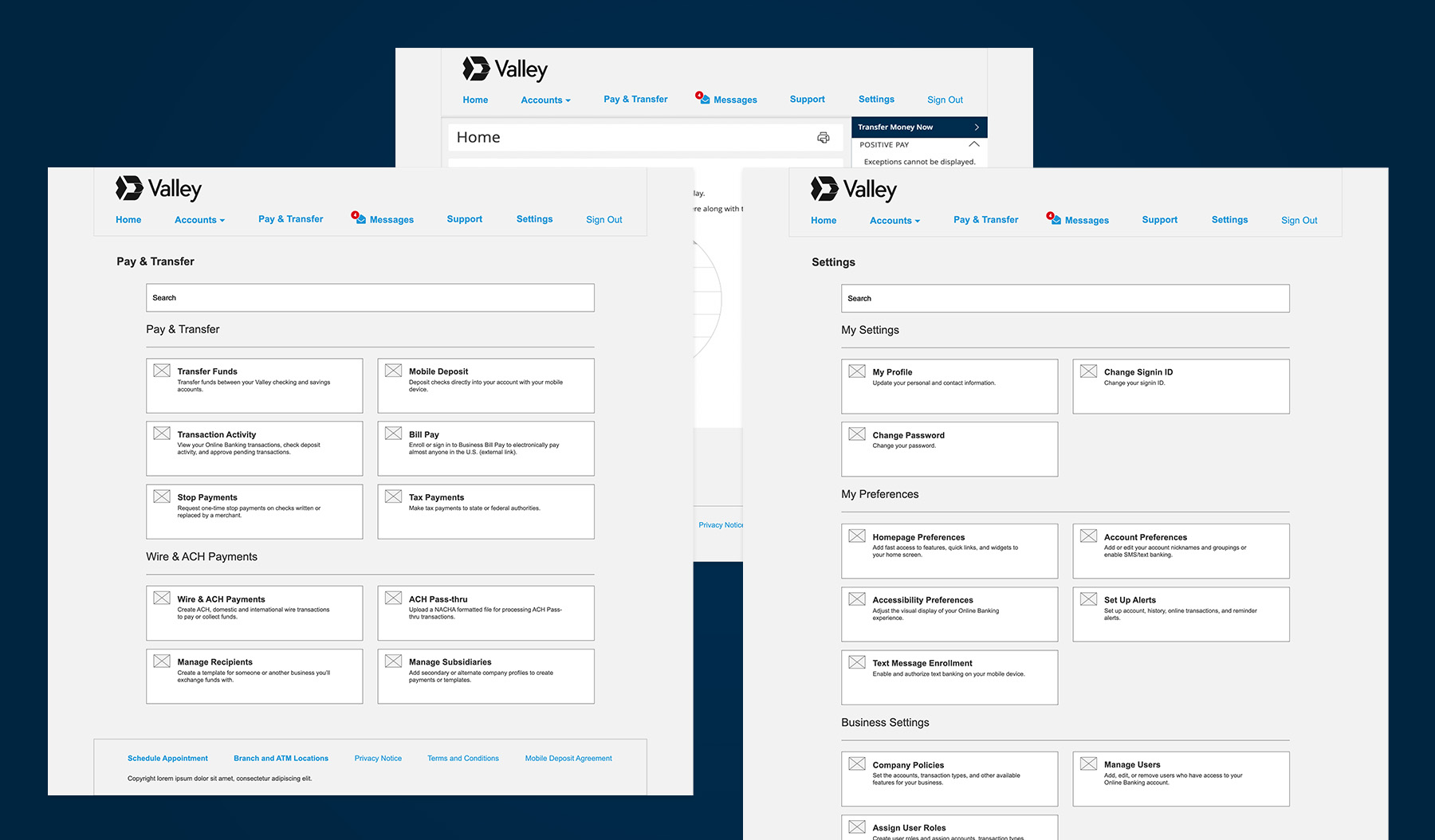
Valley's online business banking platform was due for an upgrade that would change the design landscape: side navigation was going away. The shift to horizontal navigation wasn't optional — and it landed on top of an experience that was already working against business customers.
From buried workflows to non-standard labeling and online banking platform constraints, the navigation redesign became more than a response to a platform upgrade. It was an opportunity to fix what wasn't working — and build something business customers could actually rely on.
Navigation wasn't task-based
Navigation items weren't organized by task-based models. Labels were unintuitive or didn't align with jobs-to-be-done.
Ambiguous labels & terms impeded wayfinding
Menu and page names are unclear and not aligned to industry standards, leaving users struggling with wayfinding.
High-value tasks were buried
Critical actions like payments, transfers, and account management weren’t surfaced clearly, making the most critical tasks harder to access.
Continuous improvement
Drive improvement through direct feedback and ongoing prototype testing.
Enable self-help
Accelerate discoverability of the top 10% most-used features, optimize self-help resources and wayfinding.
Drive clarity in navigation structure
Implement a user-aligned taxonomy that conforms with industry benchmarks.
I aligned the team of UX writers, designers, and researchers on what we needed to learn before making any design decisions.
Across all seven institutions, three patterns held:
These findings drew a clear contrast with Valley's existing experience. With a clear point of view on where the gaps were and what the industry standard was, I set the strategic direction for design and usability testing.
Armed with competitive benchmarks and behavioral data, I led the team in developing a new information architecture taxonomy — the strategic foundation for a two-round card sort and a tree test conducted with a low-fidelity prototype.
Test participants were recruited from our target population: active business owners. Their mental models, not internal assumptions, shaped what came next.
New discoveries with Q2 changed the scope. Unknown features and role-based navigation emerged, unaccounted for in the prototype. We also learned that Q2 enables customizable landing pages—category hubs that can reduce reliance on deep menu structures entirely.
I guided the team to revise the prototype with four new hypotheses based on these capabilities.
Following the incorporation of additional role-based navigation items, I directed the team to run a second round of usability testing with both general population participants and Valley small business owners across varying levels of platform experience.
The general population outperformed Valley customers in overall task success ,consistent with our hypothesis that broader banking experience and more complex business needs translate into stronger navigation intuition.
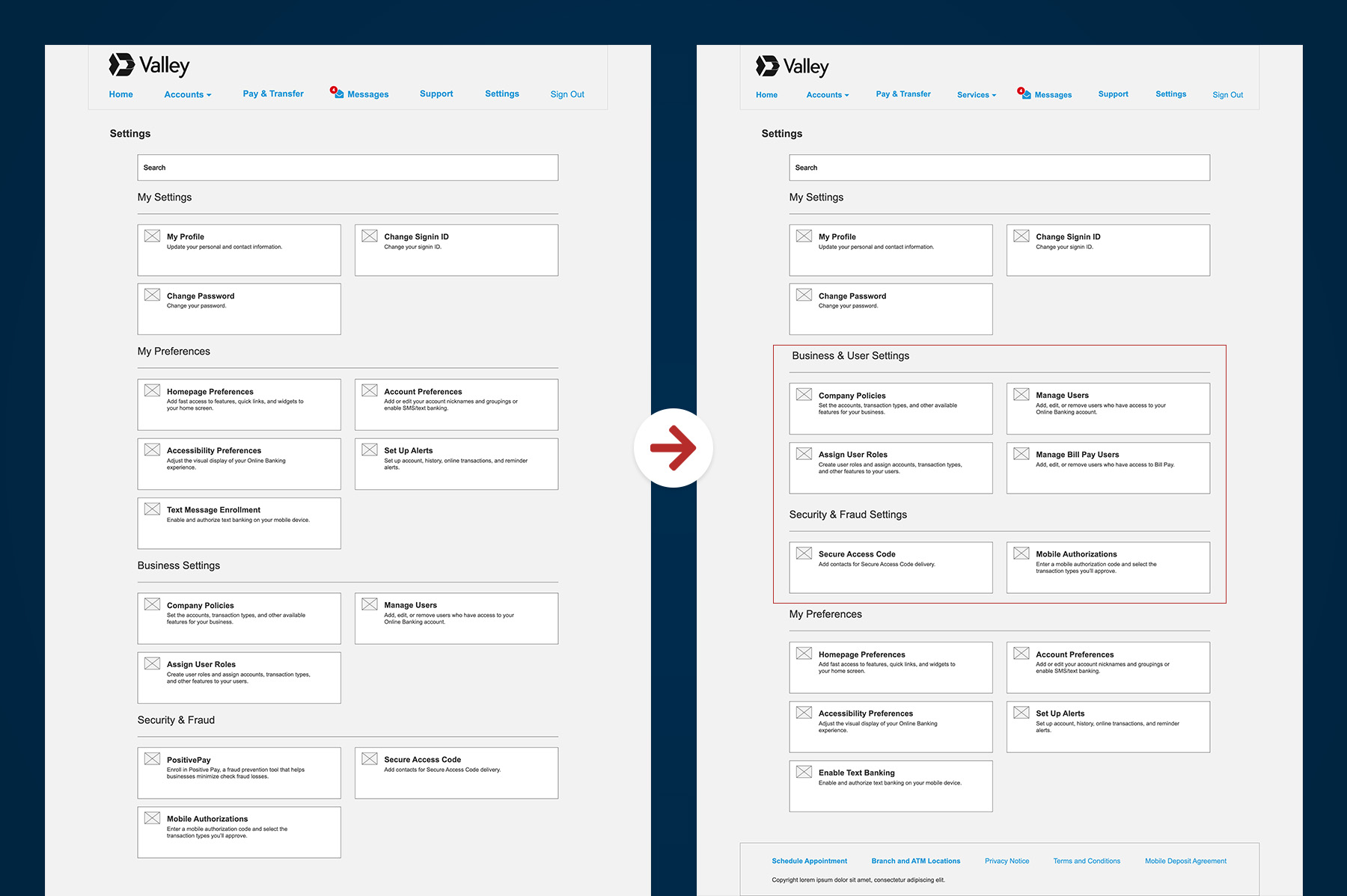
Valley customers gravitated toward Settings, but only a fraction completed the task successfully, landing instead in unrelated sections.
Recommendation: Retain the Settings placement, but surface User Roles more prominently and reorganize the section to prioritize critical business controls.
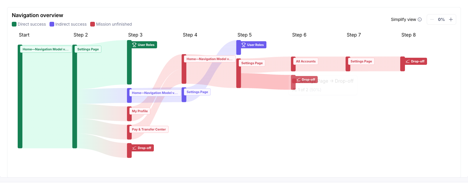
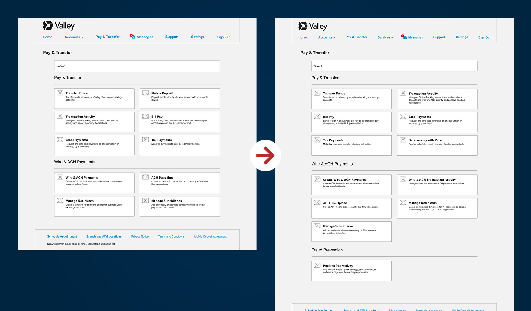
Most testers across both groups chose Wire & ACH Payments over Transaction Activity, but esoteric terminology created confusion.
Recommendation: Rename navigation items to reflect user intent, clarify the distinction between payment creation and transaction history, and duplicate key access points to reduce dead ends.
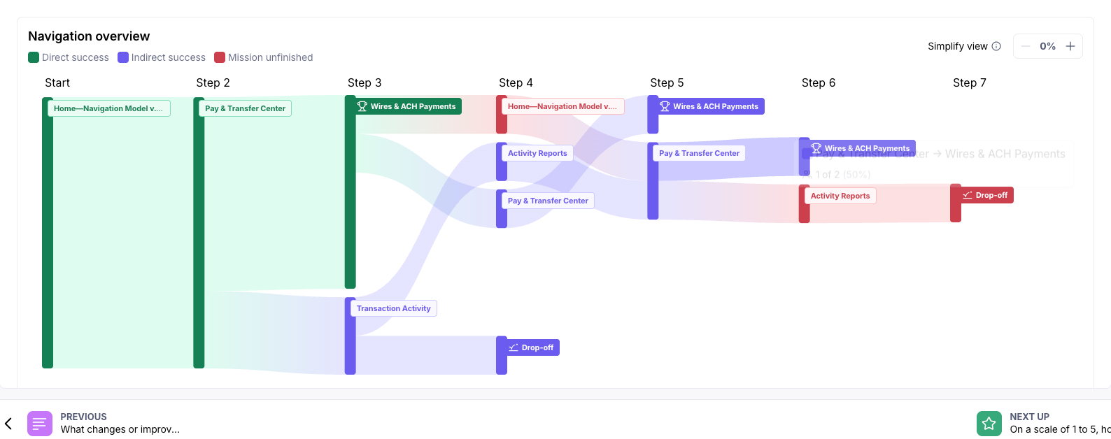
Both groups recognized Positive Pay as a service, not a setting. Yet, most looked for it in Settings anyway.
Recommendation: Relocate Positive Pay to Pay & Transfer under a dedicated Fraud Services section, and conduct follow-up research to align labeling with industry standards.
Before advancing to a third round of testing, I directed my research to conduct a targeted competitive analysis to resolve the Positive Pay placement problem. The research examined how leading financial institutions label and surface fraud-prevention tools in their navigation.
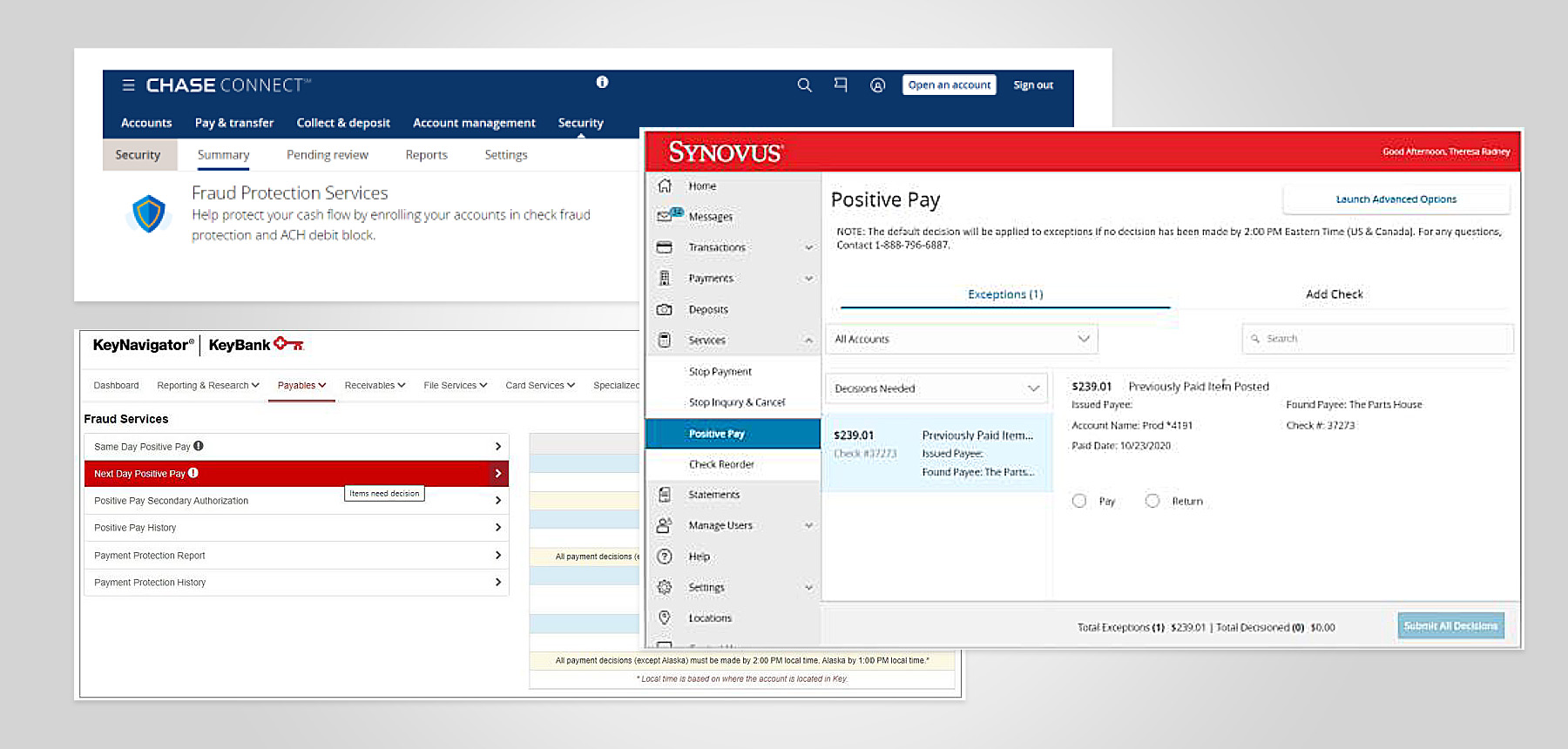
Most institutions treat fraud management as a distinct service category, not a buried setting, and use plain-language labels that signal protection rather than product names.
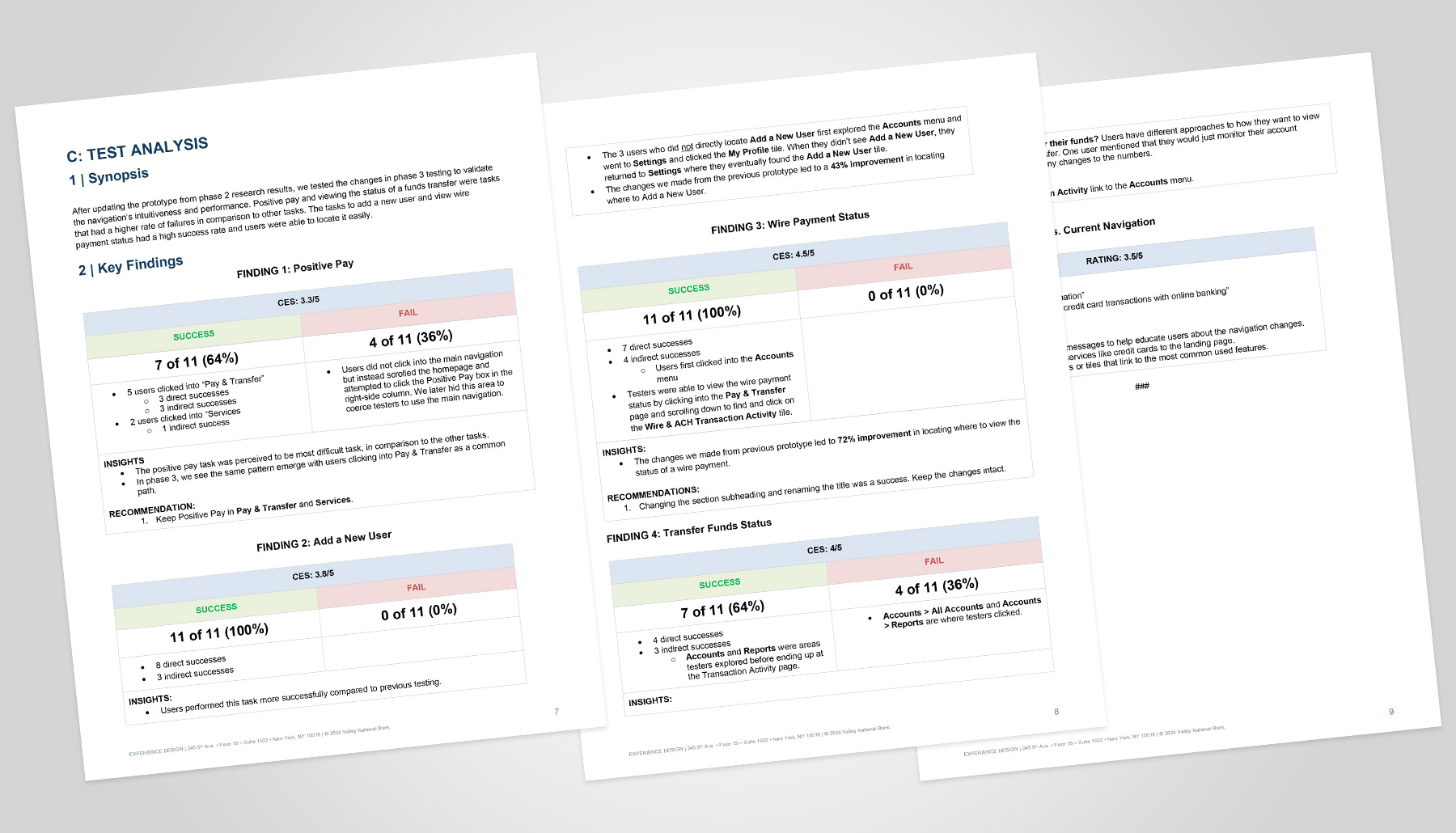
Armed with that context, the team updated the prototype and ran a final validation. The results were decisive on two of three tasks:
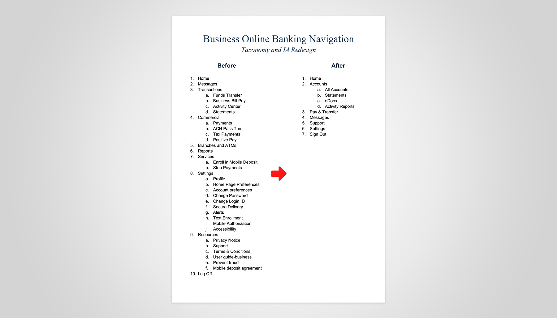
Ahead of a mandatory platform migration, I directed a cross-functional UX team through a compressed navigation redesign. I set the research strategy, led stakeholder alignment, and drove three phases of usability testing. By restructuring the information architecture around customer intent rather than internal systems, the team delivered a navigation model that reduces cognitive load and customer care call volume.
≈20%
Reduction of navigation-related customer care support calls post-launch.
↓60%
Percentage of navigation misdirects reduced during testing.
2 / 4
The average number of navigation path clicks reduced for high-frequency tasks.
Start with proven signals, then validate
Competitor patterns, customer feedback, and industry conventions provided a strong starting point, allowing the team to form hypotheses quickly and refine them through research.
Strategic prioritization delivers value
With finite resources, we targeted the most impactful use cases, balancing customer needs, vendor constraints, and delivery deadlines to maximize executive ROI.
Collaboration fuels progress
Despite evolving requirements, tight timelines, and process challenges, cross-functional alignment and strong partnerships proved essential in advancing the program and achieving sound, informed decisions.