Valley In-branch Customer Verification

Valley upgraded its digital account opening platform to modernize customer onboarding, improve branch efficiency, and mitigate compliance risks. This project focused on optimizing processes, tools, and support to benefit both customers and staff.

Role Director, Experience Design (UX Designer, Researcher, Writer)

Partners Product · Engineering

Deliverables High-fidelity · Content

Tools Figma · Maze · Miro

Timeframe 6-8 months

Company In-house

The Problem

KYC (Know Your Customer) is a regulatory and operational framework used by financial institutions to verify the identity of clients during onboarding and throughout the customer lifecycle. It helps prevent fraud, money laundering, and identity theft.

The out-of-the-box solution presented screen comprehension and usability challenges, resulting in increased back-office corrections, onboarding delays, and compliance risks due to manual overrides and incomplete documentation. Over time, Experience Design and Product revisited the KYC flow as we learned about new user pain points.

Opportunity

Reimagine the KYC flow using moderated banker interviews and unmoderated usability testing to inform design and content decisions. The initiative aimed to:

  • Streamline the verification process.
  • Reduce errors made through manual overrides.
  • Improve associate confidence and compliance adherence.
  • Surface pain points through direct feedback and prototype testing.
Success Measurements

While quantitative metrics were difficult to capture due to limited tracking of errors or call volumes, the team focused on:

  • Reduction in back-office fixes: Fewer applications require correction after submission.
  • Enhanced AML compliance: Improved documentation and ID verification.
  • Associate feedback: Positive responses to prototype usability and clearer override guidance.

Process

Research

PHASE 1 (2023): Did we implement KYC correctly?

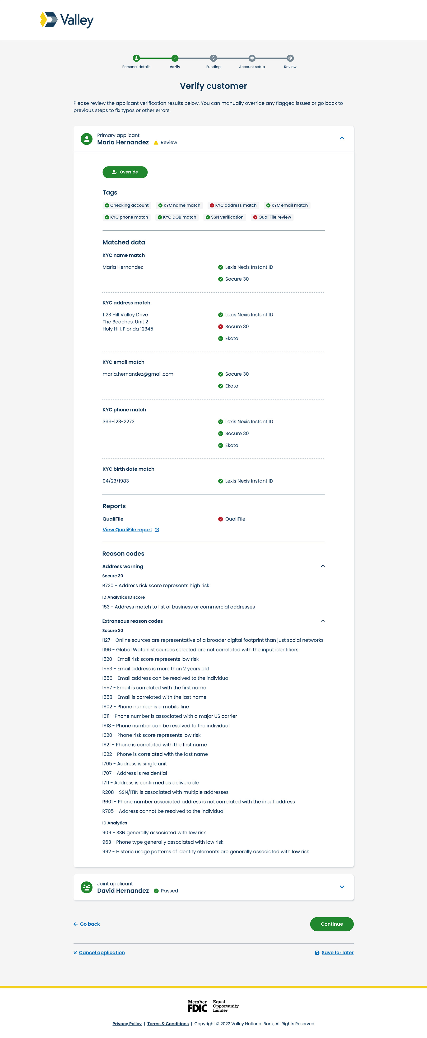
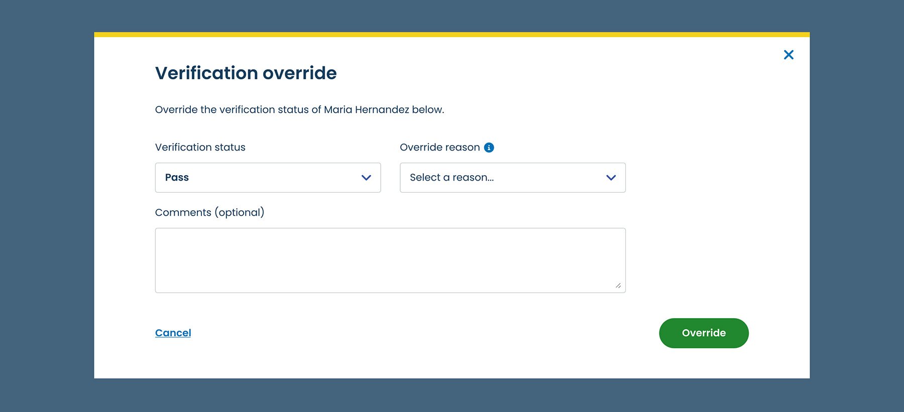
Alloy (the fraud and compliance checks system) and Terafina (the account opening platform) heavily influenced the interface’s design due to their respective functionality. As UX Lead, I partnered with the UX Research team (a separate unit at the time) and Product to design an initial concept, which we tested with a pilot group of branch associates.
What We Learned
  1. Process Simplicity: Most bankers reported that the new verification process was simple. However, legacy system power users struggled to adjust to the new workflow.
  2. Reason Codes & Labels: Bankers were unsure how to use the returned reason codes and found the section labels unintuitive.
  3. Guidance & Consistency: While bankers could identify verification tags, they needed more guidance on what action to take next—especially for manual reviews. Each branch had different methods for handling customer verifications.
  4. Multitasking Challenges: Bankers often multitask, balancing customer interaction, data entry, and lengthy customer care calls, which divides their attention.
  5. Visual Indicator Confusion: Visual indicators, such as green and red icons, were often misinterpreted, leading to confusion about verification status.

Overall, the research findings revealed a need for clearer on-screen guidance, more intuitive visual cues, and better support for edge cases.

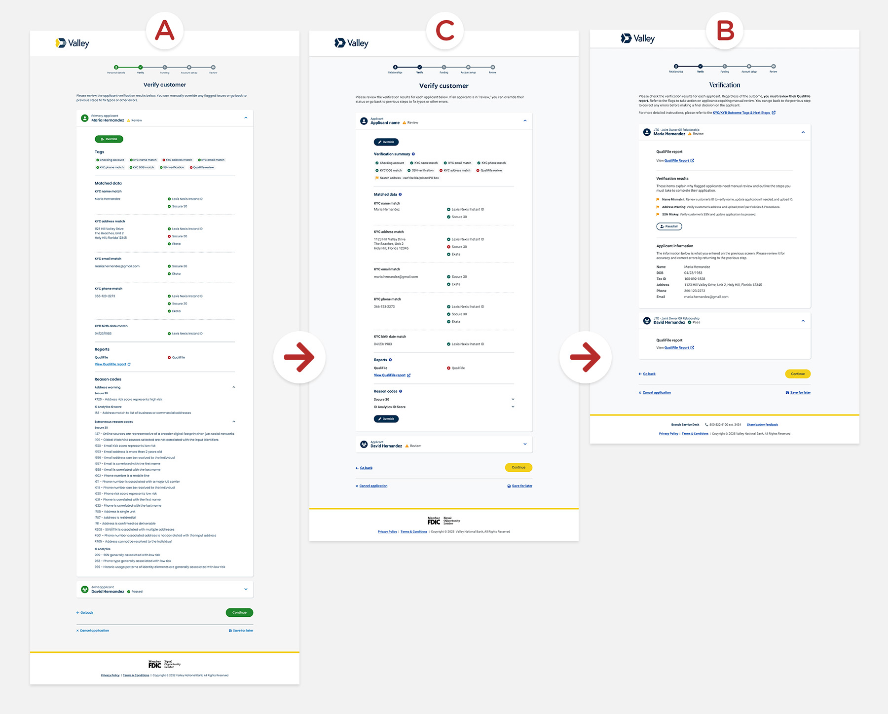
How the Design Evolved
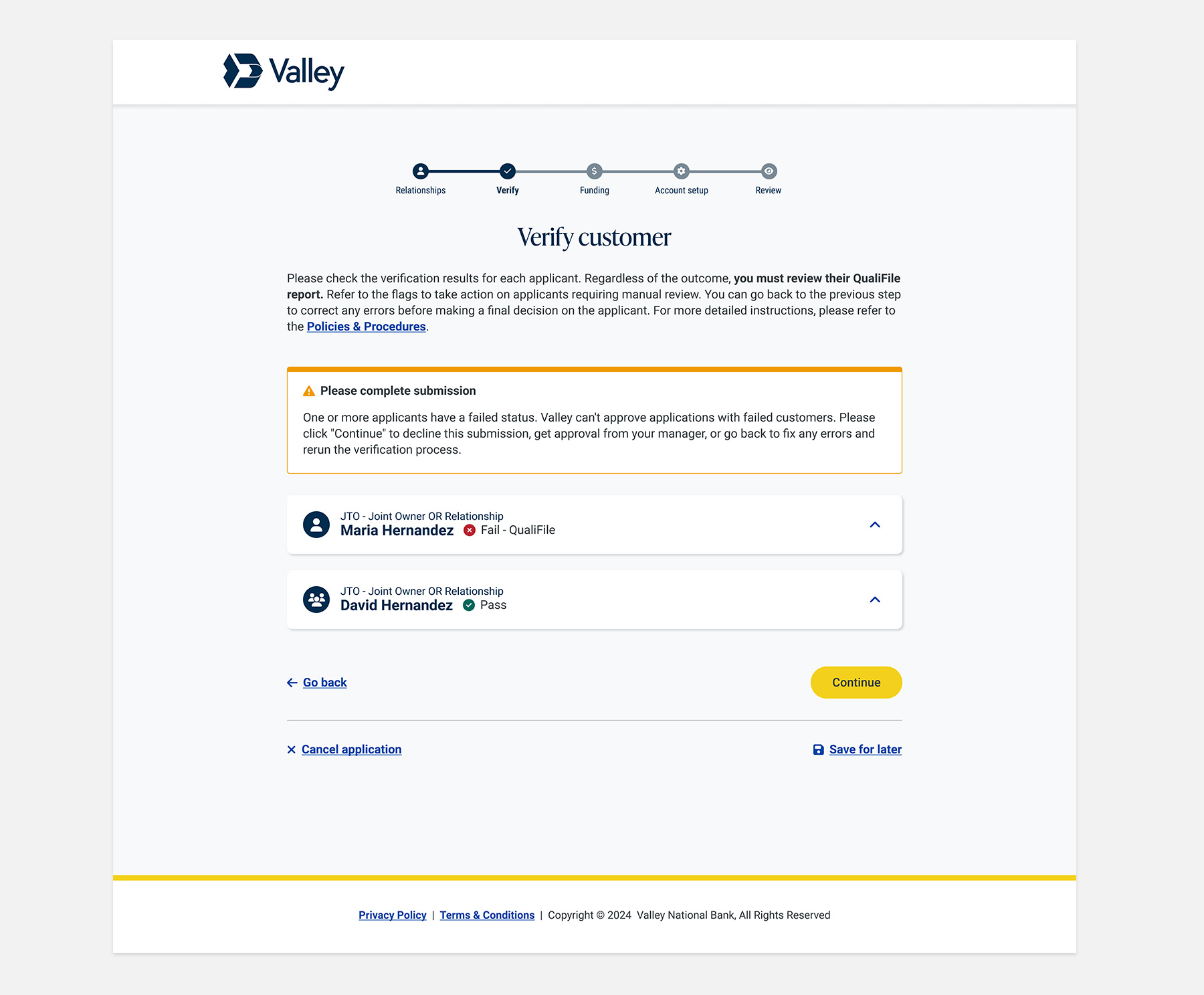
  • Collapsed the Reason Codes to shorten the page and hide non-essential information.
  • Added a second override call-to-action to the bottom of the screen to invite interaction.
  • Renamed section headers and added tooltips for context, clarity, and guidance.
  • Added instructional “verification flags” to the Verification Summary to clearly instruct bankers on what to do next.

NOTE:  By this iteration, we had rolled out the new design system.

No items found.

Define

No items found.

Ideate

No items found.

Branding

No items found.

UX Design

PHASE 2 (2024): Why are there persistent application issues?

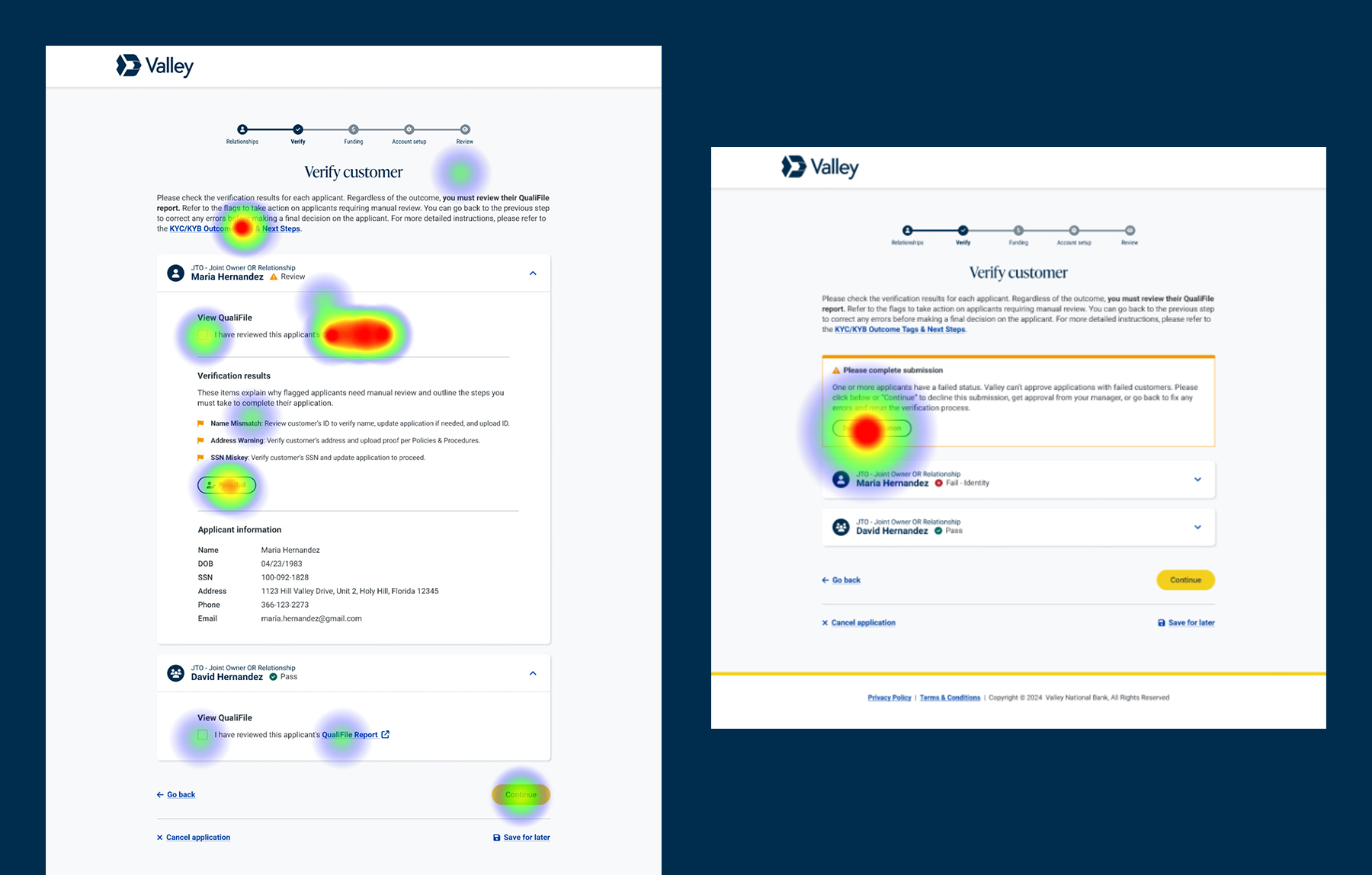
Since July 2024, 411 applications were returned with the QualiFile tag in a canceled, saved, abandoned, or expired state, among other errors. The Retail team provided direct feedback about persistent pain points and tasked us with addressing them by improving the interface. We learned that bankers mishandled applications requiring manual review, resulting in compliance issues and unhappy customers.

Retail Team’s Feedback
  1. Lack of Clear Calls-to-Action: Although bankers understood that the customer’s application required manual review, the verification flags still lacked a clear call to action, leaving them unsure of what to do next.
  2. Misinterpretation of Visual Cues: Bankers continued to misinterpret the color-coded Matched Data sources as indicators of a passed or failed application, when they merely signified that the data source had been executed.
  3. QualiFile Report Oversight: Some bankers did not review the QualiFile report because they were unaware it was a required action, regardless of the verification outcome.
  4. Insufficient Override Comments: Bankers were not leaving enough detailed comments during the override process to explain their pass/fail decisions.
  5. Incomplete Submission Process: Bankers often failed to properly finalize submissions after failing a customer. They abandoned or canceled the application instead of declining them, which sent the wrong notification to the customer.
  6. Irrelevant Information: The Matched Data and Reason Codes were not considered relevant and distracted bankers from taking necessary actions.
How the Design Evolved

With a broader Experience Design team reporting to me by this time, I was still hands-on, but led UX Research and UX Design to improve and test a new solution.
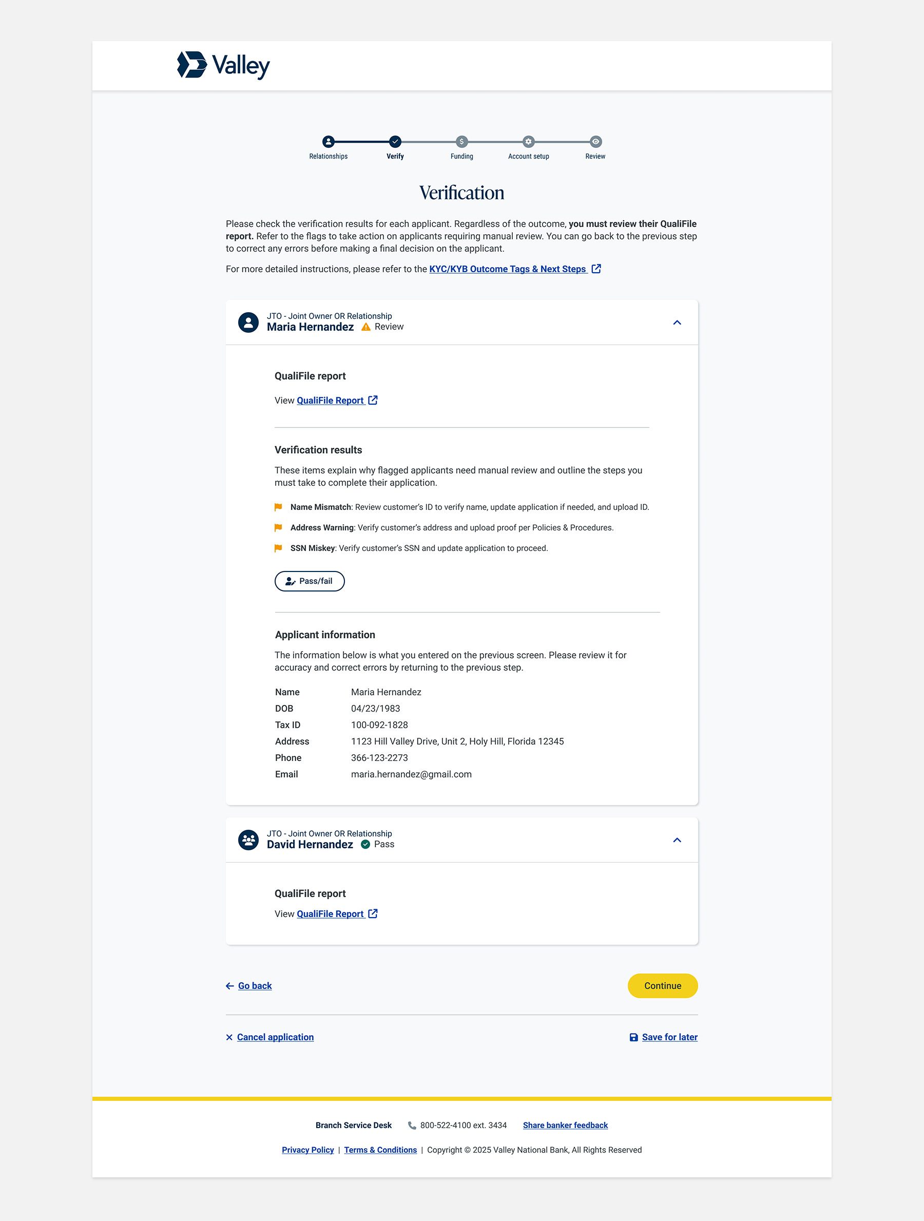
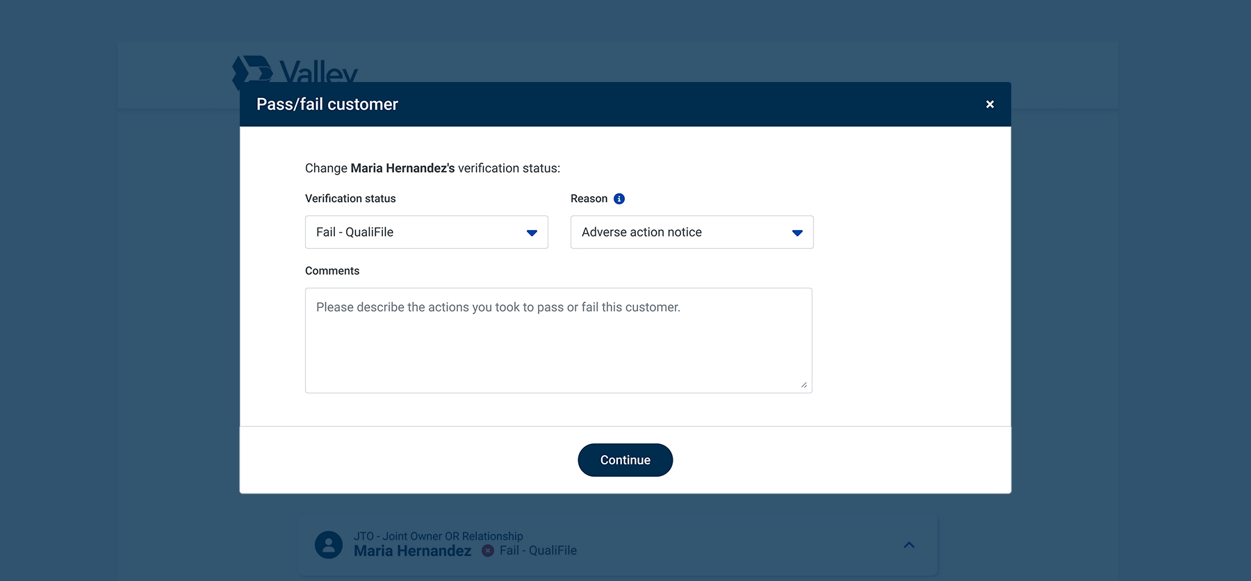
  • As the UX Writer, I partnered with Product and stakeholders to enhance the verification flag content and provide clearer instructions on the actions bankers should take.
  • Remove the red and green visual indicators from the Verification Summary so the bankers will only see the verification flags.
  • Remove the Matched Data and Reason Codes sections, as these data sets were not relevant to bankers.
  • Add an alert to prompt bankers to hit “Continue” to decline the application.
No items found.

Visual Design

No items found.

Testing

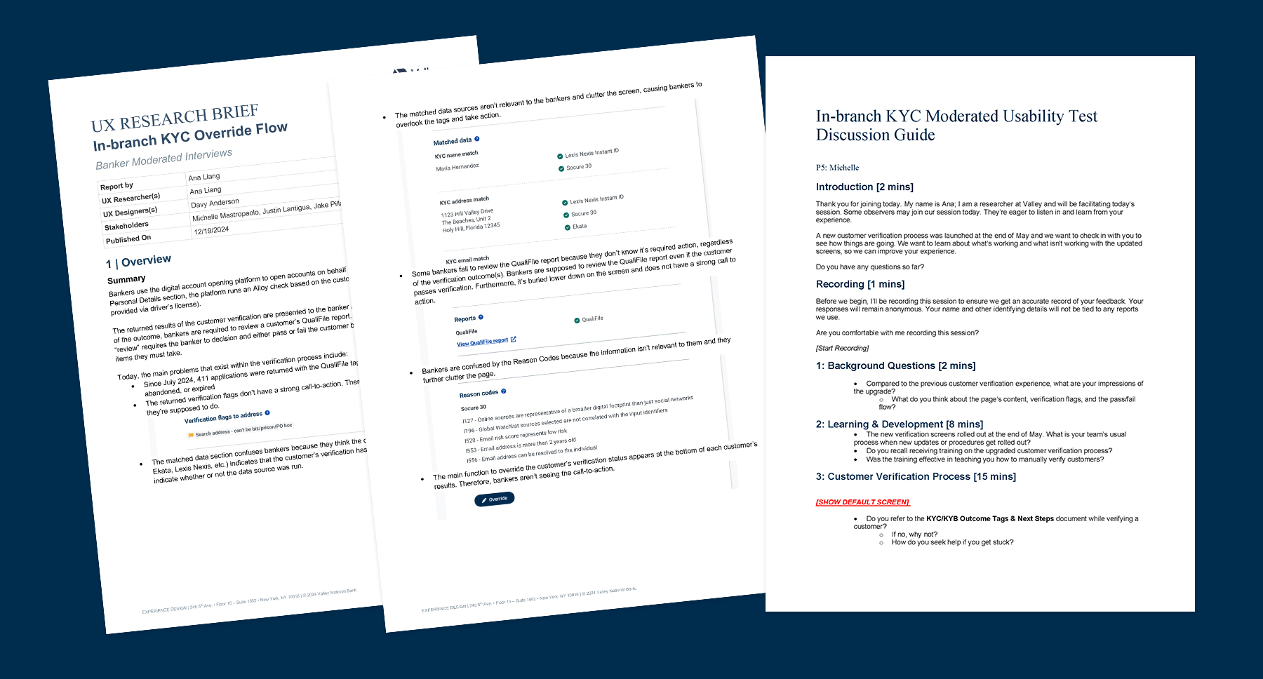
I led the UX research effort to conduct usability testing with branch employees who frequently appeared on the deficiency list. We also invited learning and development associates responsible for training bankers to participate.
We Aimed to Learn
  1. Do bankers understand what the QualiFile report is and how to use it to verify a customer?
  2. Are bankers reviewing the QualiFile report regardless of the verification outcome?
  3. Are the new verification flags intuitive and helpful in guiding bankers on their next steps?
  4. What do bankers do when they’re stuck and need help?
What We Learned
  1. QualiFile Understanding: Bankers generally understood the purpose of the QualiFile report and saw the relocation of the QualiFile link to the top as a positive step in the right direction.
  2. Verification Flags Clarity: Testers found the new verification flags intuitive and helpful in providing clear instructions on what to do next. The flags received a rating of 4.8/5 for clarity.
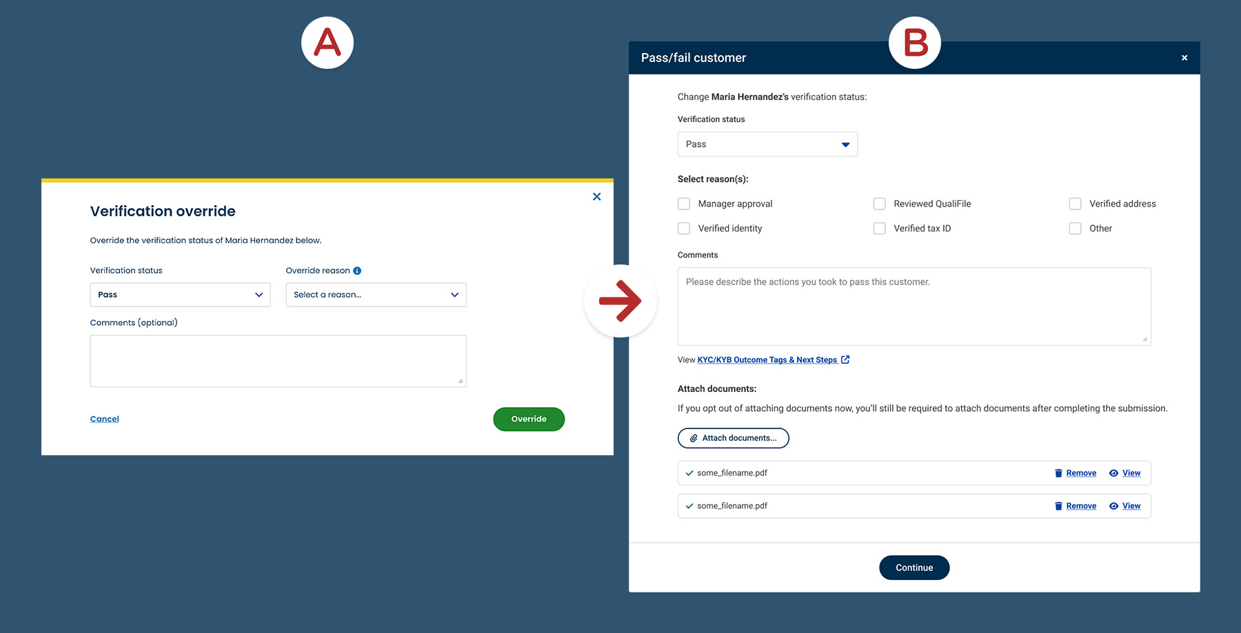
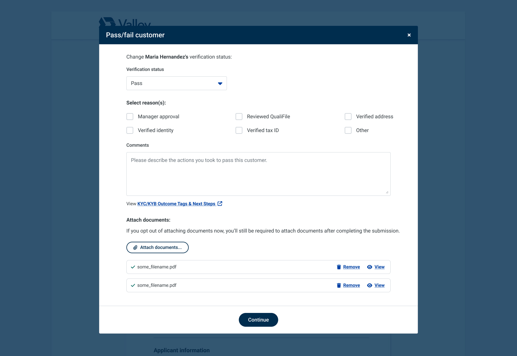
  3. Pass Flow Feedback: Testers rated the pass verification flow a 3.8/5, with some concerns linked to prototype issues or bank policy. Suggestions included enabling document upload during manual review and offering more pass/fail reasons.
  4. Fail Flow Feedback: Testers rated the fail verification flow a 4.4/5. Some testers found the alert message confusing, particularly regarding whether to click "Continue."
Quotes

“The QualiFile report helps to determine if we can open the account for the client or not, and to see the previous history of the client's banking.”
— Participant 338140112

“I would like the opportunity to select more than one reason (we may be asking a lot for personal bankers to select the most appropriate reason, or the branch manager might disagree).”
— Participant 334086386

“The part where it said ‘click decline or click continue’ was a little confusing. I wasn't sure if clicking 'Continue' was just another way of declining, or if it meant I wanted an override from a supervisor.”
— Participant 337679316

“The flags seem clearer now, and I like that we can specify why the customer has failed.”
— Participant 337679316

“During the process, it would be great to be able to upload documents within the verification process, rather than after opening the account.”
— Participant 334628397

Overall, testers found the updated flow to be clearer and easier to understand, but there was still room for improvement to provide more step-by-step guidance, flexibility, and a clearer path to advance the application.
How The Design Evolved
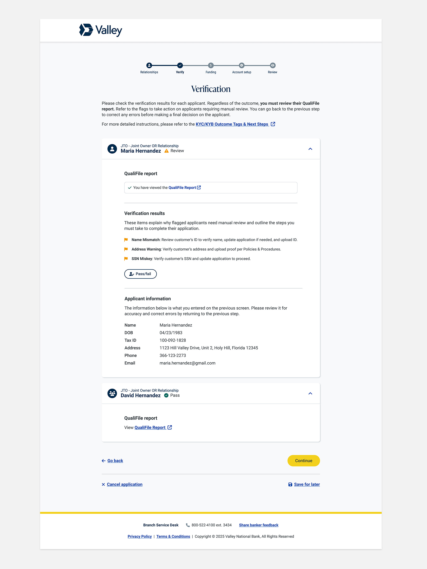
  • Overhauled the pass/fail modal to provide more step-by-step guidance, enable document upload, and enhance data collection.
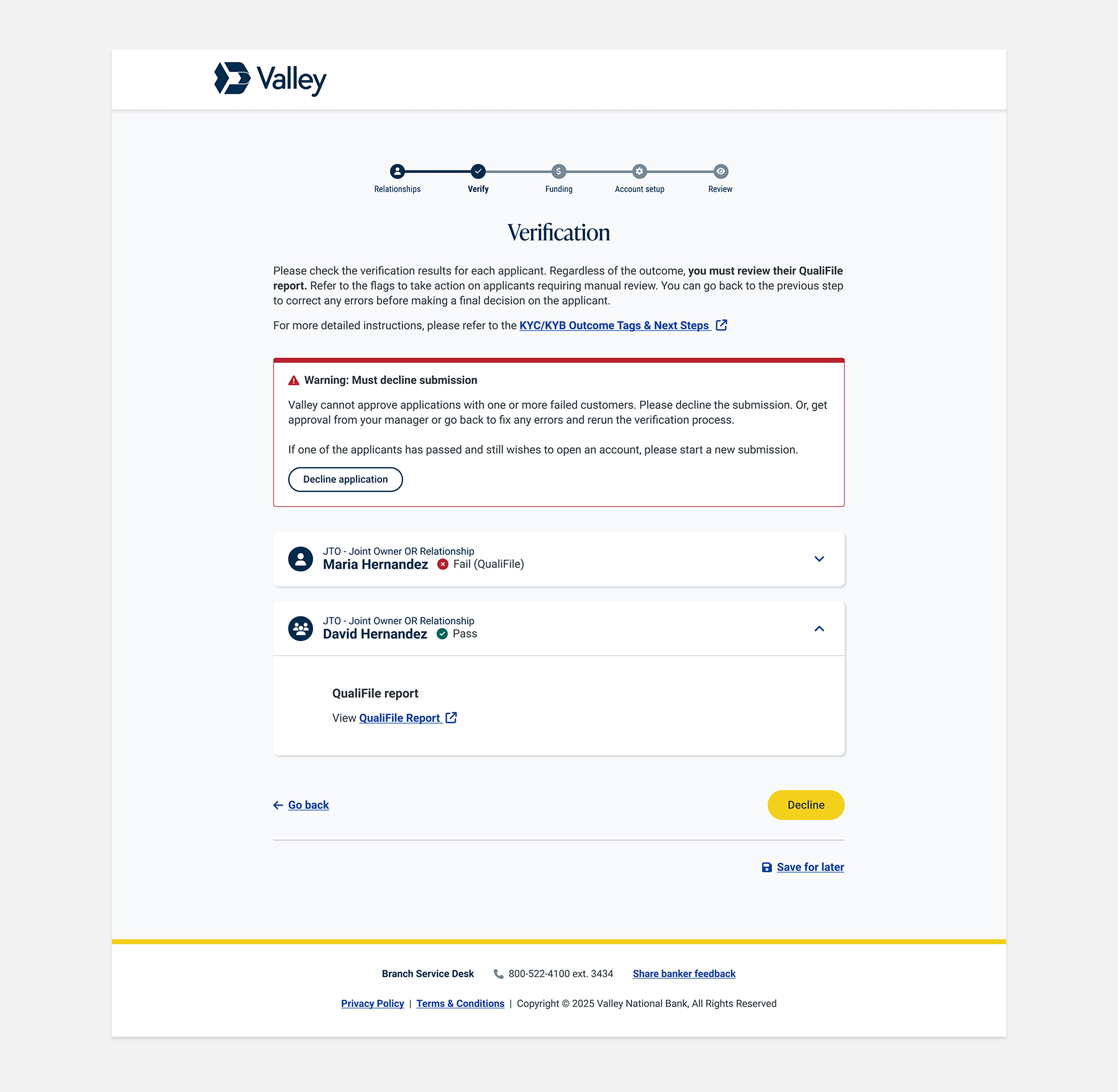
  • Open all customer accordions by default, allowing the banker to view all action items at a glance, regardless of verification outcome.
  • Added a checkbox to the QualiFile report section to encourage interaction and track compliance.
  • Rewrote the warning message to inform bankers that any failed customer must be declined.

PHASE 3 (2025): Wait, bankers are still mishandling applications?

While we made improvements based on feedback from Retail and our studies, the data showed that bankers were actually mishandling more applications than before! How could this be possible? The question then was: why?
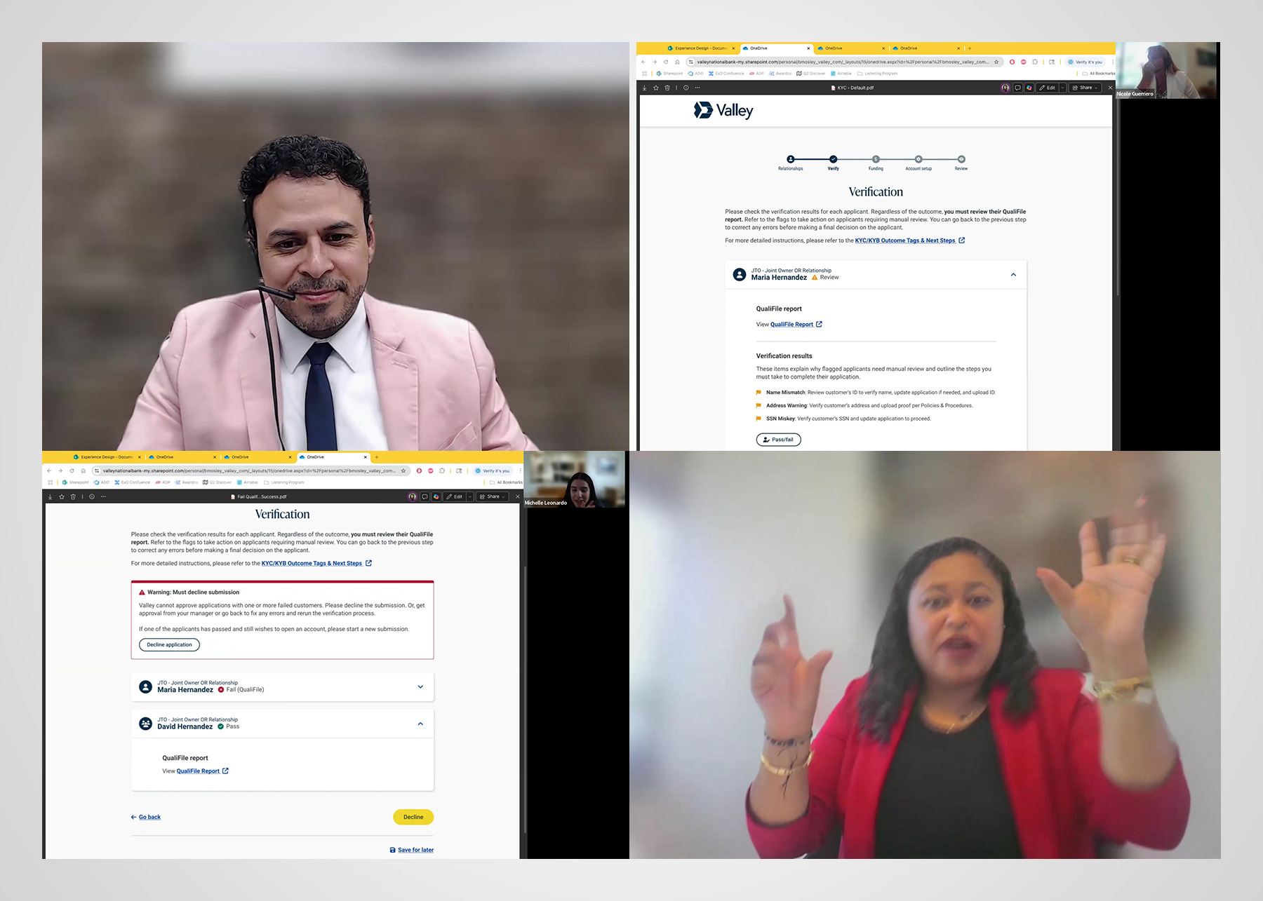
Follow-up Interviews
What We Learned
  1. Bankers found the new verification flags clearer and more helpful, which improved efficiency and reduced errors.
  2. Bankers reported that they appreciate how the interface upgrade enforces and tracks Qualifile reviews.
  3. Bankers understood that they must click "decline" to ensure that applications are tracked and customers receive the proper communications about their application.
  4. Bankers complained about inconsistent or inadequate training and struggled to use instructional documents linked at the top of the page.

Despite the interface receiving very positive reviews, there was nothing further for UX Design to address. Our hypothesis is that bankers need better or more consistent training and improved support materials to guide them through the process. We believe there are deeper challenges—such as incentives and operational motives—that contribute to why some bankers continue to open applications incorrectly.

We shared our findings with Retail and Learning & Development to help close those gaps.
No items found.

Results

After multiple rounds of designing, testing, and learning from both banker and customer feedback, we continually evolved the banker’s experience over time. These ongoing improvements not only impacted bankers’ daily workflows and confidence but also enhanced the in-branch experience for customers by making processes smoother and more transparent.

Results are pending; expected outcomes include improved efficiency, compliance, and associate satisfaction, pending final measurement.

Lessons Learned
  • UX design can't fix all behavior outside digital interfaces.
  • Actions often differ from what people say they do.
  • Failure means something needs adjustment, not blame.